User Research & Design System

Brief Overview -
✨ Introduction
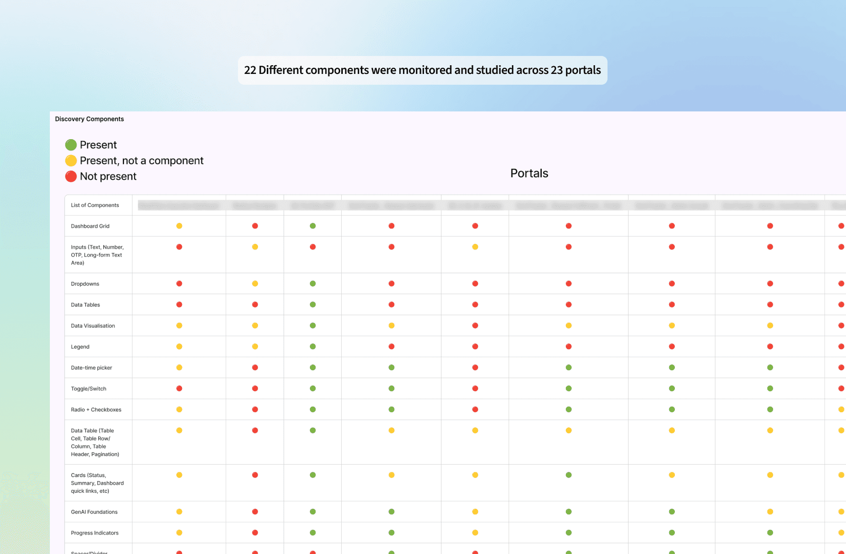
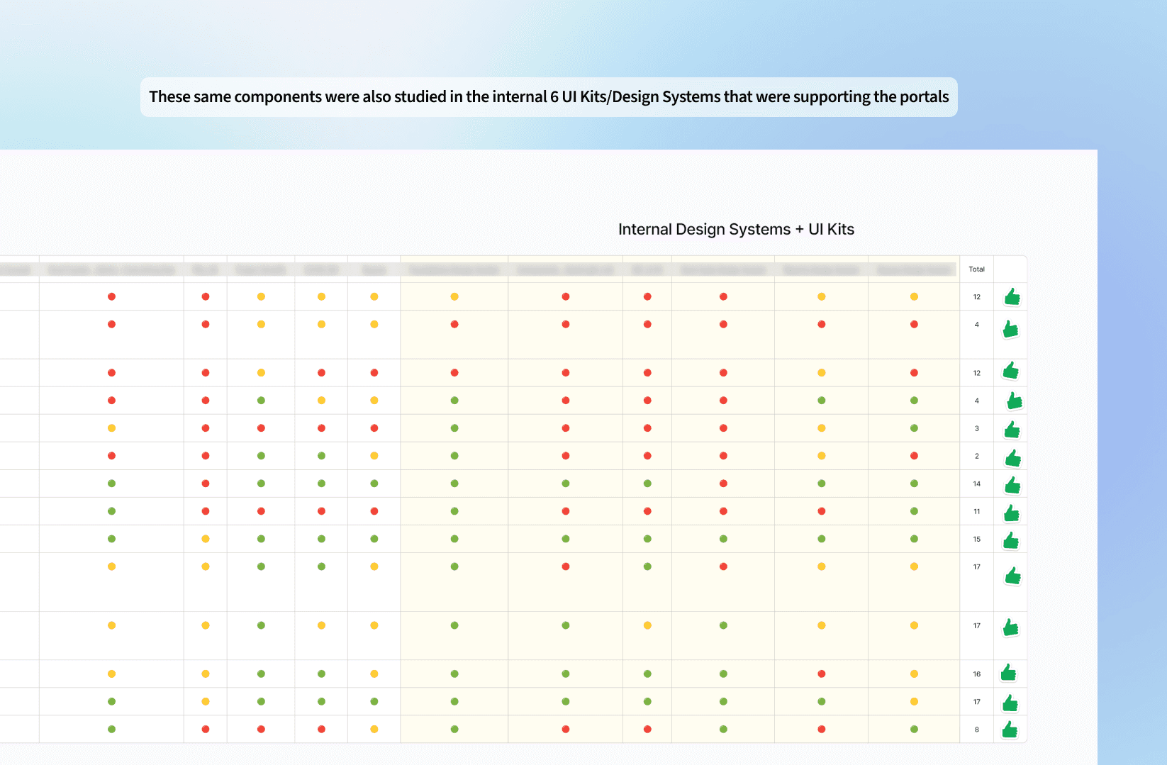
When working on enterprise-scale design systems, I always start by zooming out—looking at the bigger picture of how multiple product suites connect, operate, and evolve over time. Typically, I’m part of a lean cross-functional pod: one senior from the client team, a junior from their side, and myself leading design efforts. What makes this setup work is our shared commitment to go beyond just visual kits or component inventories—we dive deep into the actual workflows, user journeys, and tech ecosystems.
At the heart of it is research in the early phases —real conversations with real people. I spend time speaking with designers and developers from different teams: internal, vendor-side, and cross-product. Each of them has unique needs depending on the type of system they’re building. For example, a team building a conversational UI tool thinks about patterns very differently than someone working on a supply chain monitoring dashboard or a GenAI-driven content platform. So instead of starting with a generic component audit, we begin with a workflow audit—understanding how and why each piece fits together.
We start by mapping out the key systems in play—internal portals, third-party tools, and headless platforms. Then, we conduct a detailed audit of workflows, components, and patterns being used. But instead of just capturing a snapshot of what exists, we ask deeper questions:
Why was this layout chosen here?
What friction points do users face when completing this flow?
Are these patterns optimized for the user's device preferences and working conditions?
✨ Styles & Foundations
GenAI is becoming a game-changer in this space. It's no longer just about adding AI components—it's about structuring the entire design system to support GenAI logic. We build for clarity—visually distinguishing automation from AI-driven decision-making so users can understand what the system is doing and trust it.
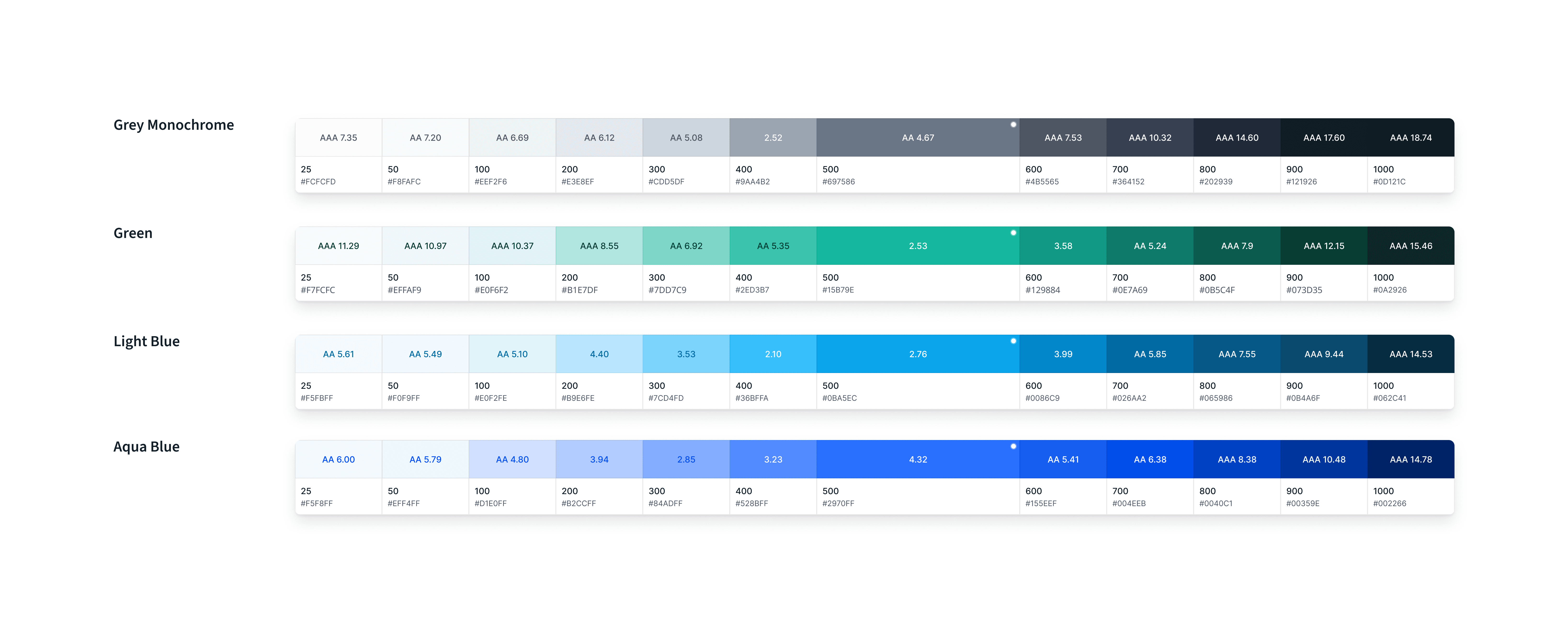
Under the hood, we invest heavily in tokenization. Every value—whether it’s spacing, radius, color, shadow, or typography—is structured into a token that syncs across Figma and the front-end (typically in Storybook). This ensures the system is not just beautiful, but consistent, maintainable, and scalable across platforms.
Having worked closely with cross-platform development teams—React, Angular, native iOS, FlutterFlow, and Veeva—I’ve learned how important it is for design to be implementation-aware. Collaborating side-by-side with developers means we solve problems early, reduce rework, and co-create patterns that are both design- and dev-friendly.

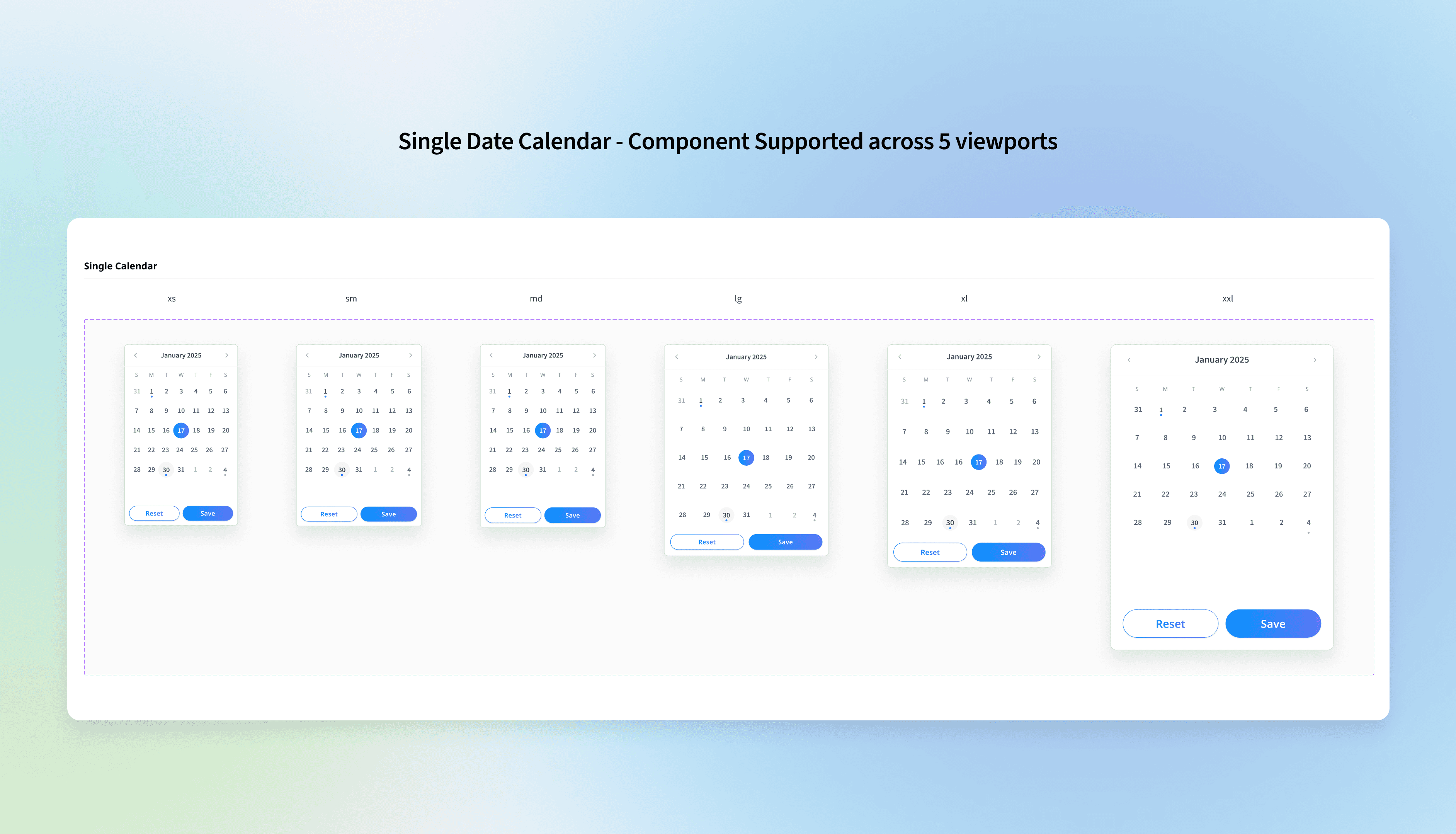
✨ Designing for multiple viewports
Understanding user context is everything. In manufacturing and supply chain environments, users often rely on tablets or large-format desktops on the shop floor, while quick mobile inputs are used for incident logging. Meanwhile, desk jobs demand robust dashboards on traditional laptops or desktops. We also evaluate the tech and functional proficiency of each user group, so we’re not just designing for ideal scenarios—we’re designing for real-world usage.

✨ Designing for varying use-cases and different needs of product teams & users.
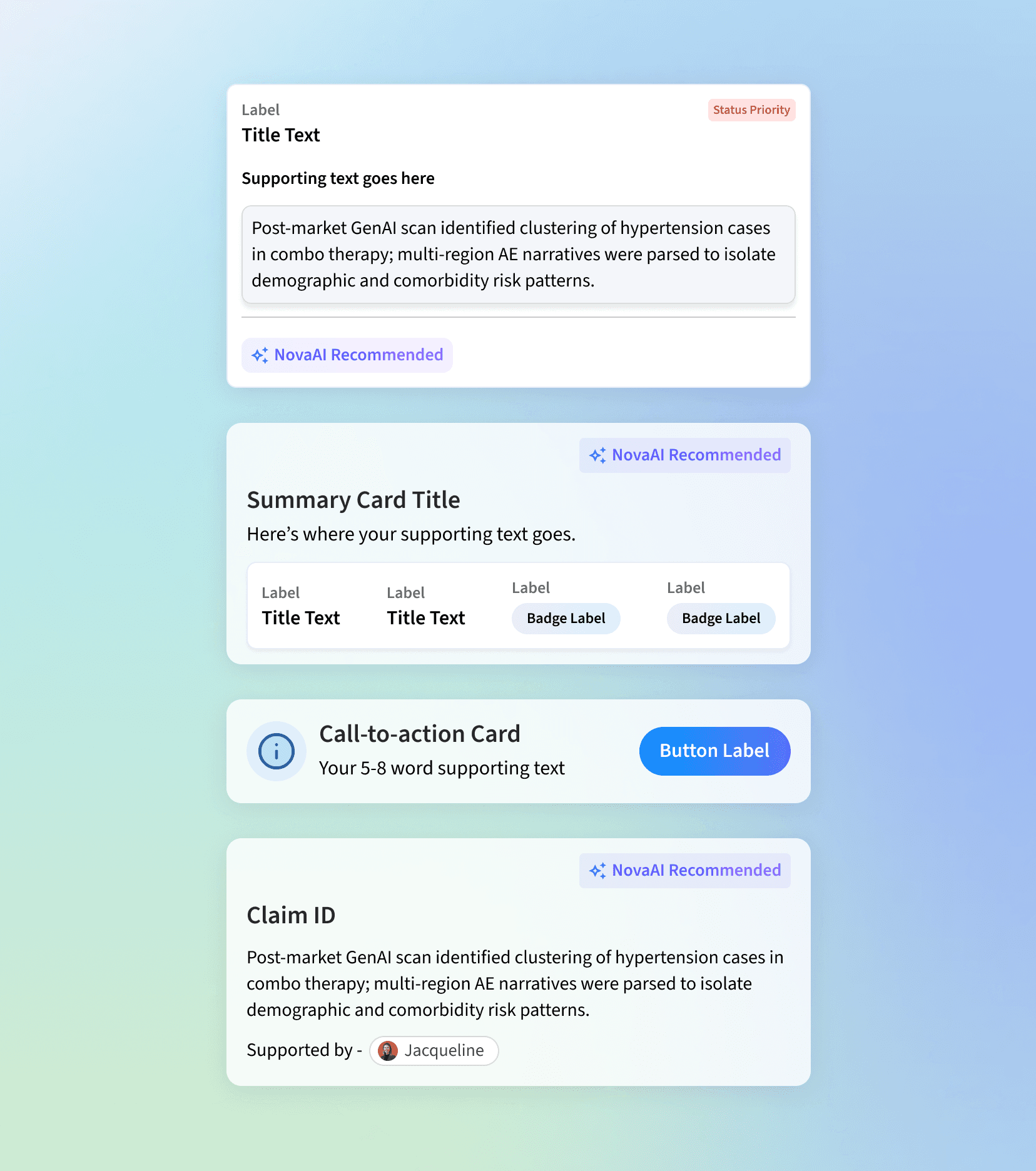
There were also use-cases where we had found it's better to offer a combination of components, with similar application use-cases because of the different needs of projects and user feedback -
Example 1 - Toast Messages: In the audits, we identified two types of toasts: a long banner positioned at the top center for desktop users and a toast located in the bottom right corner. Mobile users tend to prefer the top banner, while users on larger screens favor the bottom-right toast. Regardless of the option, both styles exhibit similar levels of user preference and usability benefits for both users and design teams. Therefore, both components can be implemented, provided they are used consistently throughout the entire portal without mixing the two styles. (Note that Option 2 is only deployed in the top center position for mobile and tablet viewports.)
Example 2 - In-line Citations: It's not always possible for back-end teams to implement in-text citations with hover functionality for the first release (Option 1). So another simpler option is give to the users where they can click on the citation number to view references in a side panel or on a separate page. (Option 2)


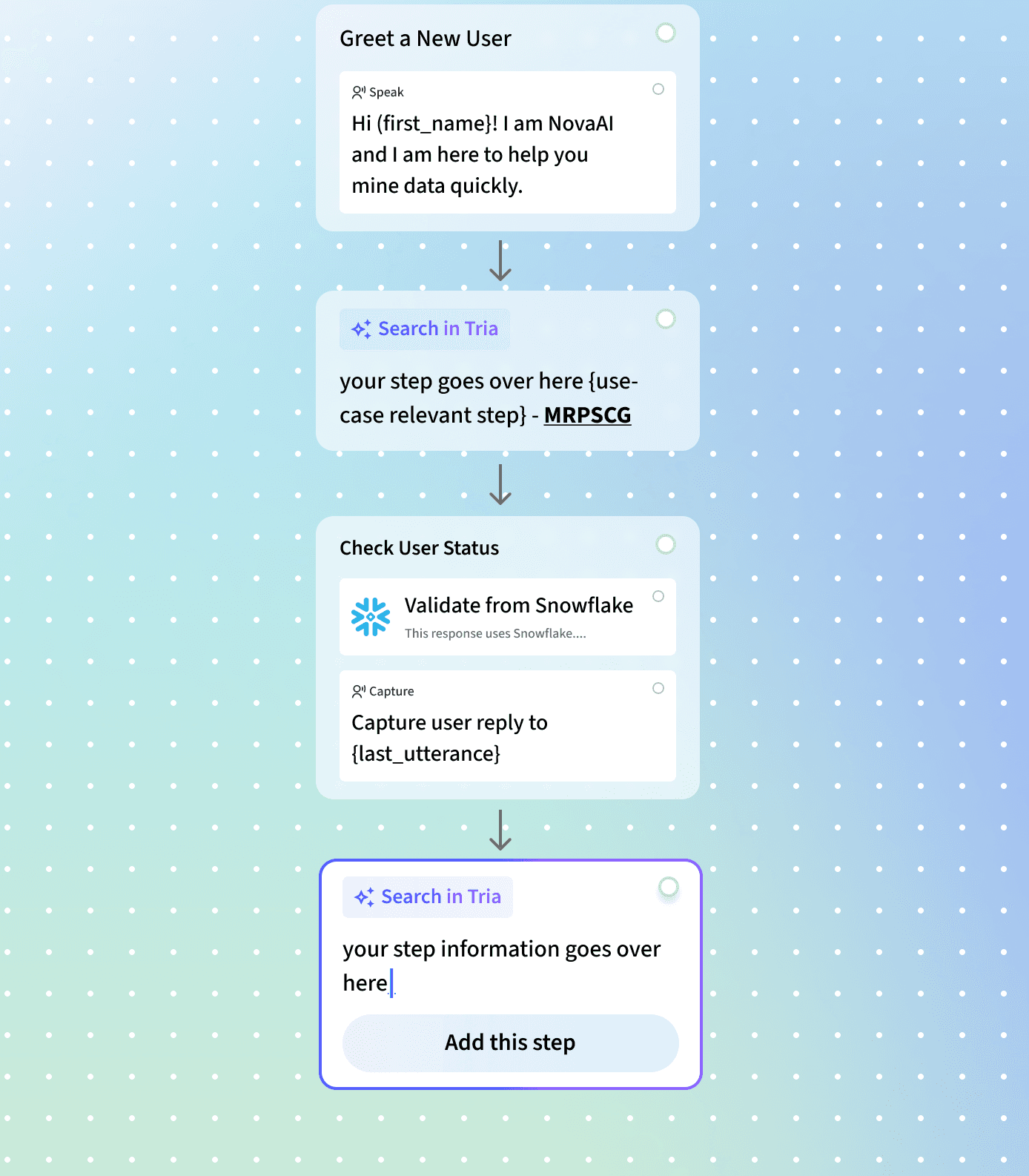
✨ Launching fresh GenAI-focused components, patterns and other hybrid components
GenAI is reshaping how we think about design systems. It’s no longer just about dropping in a few AI-related components—it’s about architecting the entire system to support GenAI logic and behavior at scale. One of our key principles is designing for clarity: helping users visually distinguish between automated flows and GenAI-driven actions so they not only understand what’s happening, but also feel confident trusting the system.
As we’ve built and scaled portals across various GenAI use cases—conversational platforms, document generation tools, and simulation systems—we’ve uncovered emerging pattern needs specific to each. For instance, in a conversational AI interface, we identified a chat bubble + system response pattern that works hand-in-hand with a “model system instruction” module. While casual users focus on query-response, advanced users rely on configurable system prompts to fine-tune their output, essentially shaping the AI’s behavior based on their workflow needs. Designing for both levels of interaction—simple and advanced—has been a key part of our system’s flexibility and success.

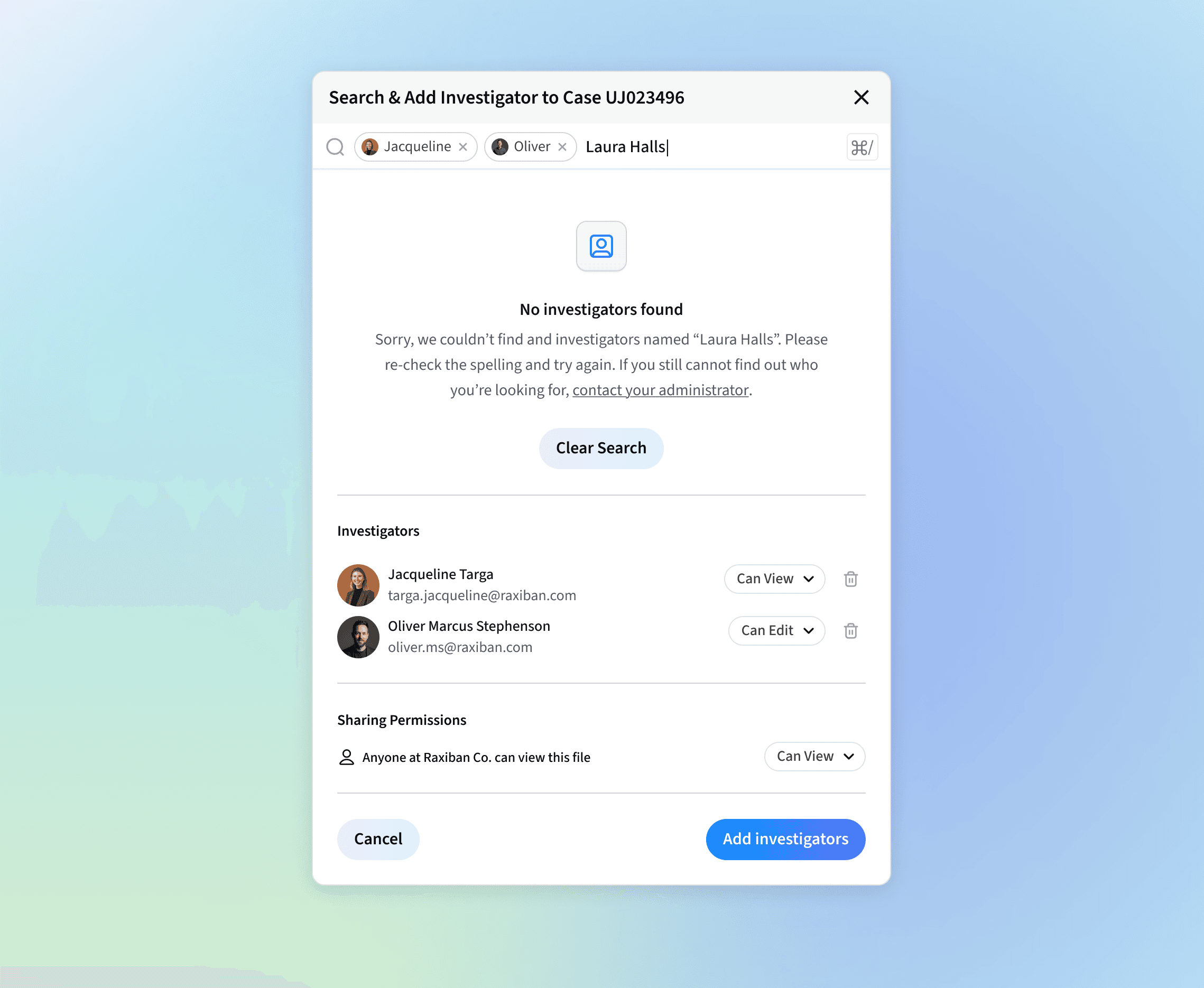
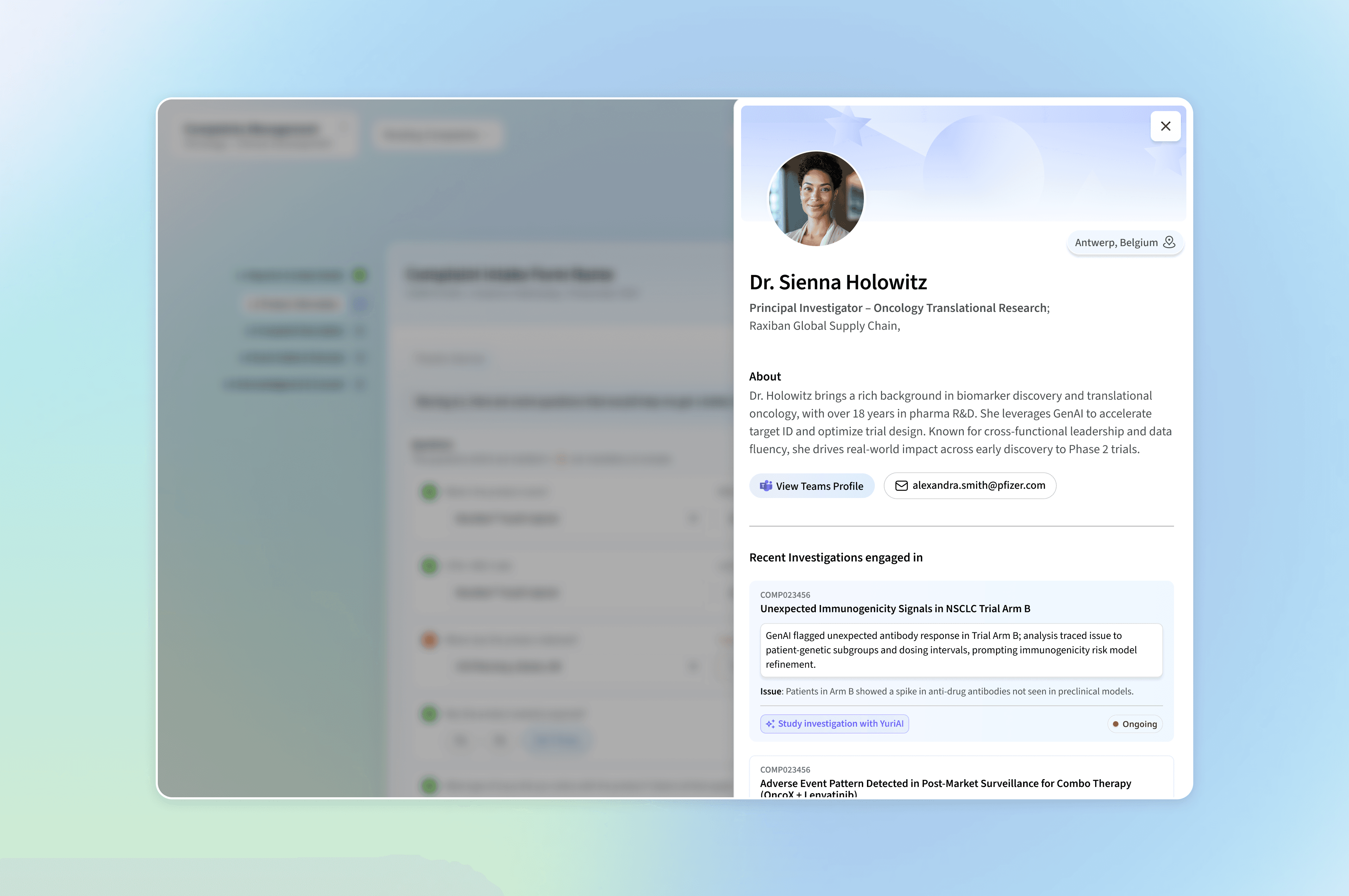
✨ Prioritising patterns over components after a certain scale of design system adoption
What often starts as a single component—a button, an input field, a card—quickly scales into patterns when placed in context. A card component becomes part of a dashboard module. A table combines with filters, bulk actions, and pagination to form a complex data-management pattern. These aren’t just UI clusters; they’re systems of interaction. So when we design, we don’t just ask “how does this look?”—we ask “how will this behave across use cases, screen sizes, and user flows?”
This is why we build with reusability and modularity in mind. By tokenizing even the smallest design decisions (like spacing, color states, or border radii), we create atomic pieces that seamlessly fit into larger, more intelligent systems. These patterns aren’t static—they flex and scale to support everything from GenAI interactions to supply chain escalation flows, adapting to different user roles, environments, and intents without breaking consistency or usability.
Here are some examples of how components stitch together into patterns like cards, modals, data-tables, etc.


🧩 What I’m Taking Away From This Work
This was one of the projects that completely changed how I look at design systems, and pushed me beyond what the work I did in my first project of building a supermassive design system in the government side of projects.
For this project, Patterns > Components: I started seeing how components become living, breathing patterns that scale across complex ecosystems. It's not just about creating a button or a card—it’s about how those pieces come together to support real workflows.
Storybook taught me to think like a system: Diving into Storybook helped me understand the importance of even the smallest decisions—like how spacing, labels, or interaction states scale and adapt across multiple product suites.
Microcopy matters more than we think: From helping users navigate GenAI outputs to making a supply chain dashboard feel more human, I saw firsthand how the right words build flow, trust, and confidence.
Fascination meets function: Somewhere along the way, unexpectedly, I fell in love with the life sciences space—especially the operational, data-rich worlds of supply chain and knowledge mining. Designing for this space pushed me to see the beauty in complex, invisible systems.
Designing for AI means designing for trust:
Nudges that reassure, not override: Subtle design cues like tooltips, inline explainers, and animations help users understand what GenAI is doing—without ever feeling pushed.
Editable by design: AI suggestions are always reviewable, tweakable, and dismissible—because systems should support human decision-making, not replace it.
I think, ultimately, design is how we learn: - this project reminded me that the process of building products is where the real transformation happens — for the system, for the user, and for me as a designer.


Whether you’re reaching out for work, want to chat about travel or social impact, or feel like dreaming up ways to make good things happen — I’m all ears. Don’t overthink it, I’d love to hear from you.