2026
·
Prosumer
About
Hotplate is a food-drop platform for chefs, bakers, and small teams running a business out of their kitchen. I designed the website with Adriano Reis (Ancorpoint Studio) who handled development in Framer.
Challenge
Chefs and bakers already know the work: announcing a menu, collecting orders, figuring out how much to make. But Hotplate’s drop model doesn’t fit familiar categories like restaurant software or food delivery. The website needed to show how it brings that work together — making its value clear through a story they could immediately see themselves in.
Outcome
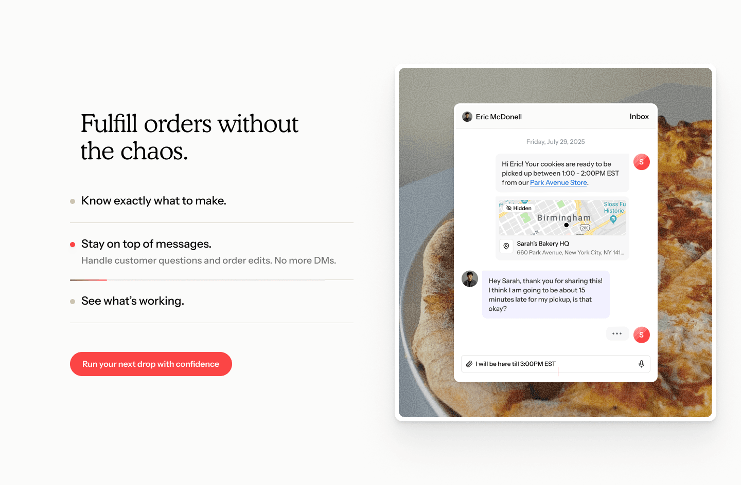
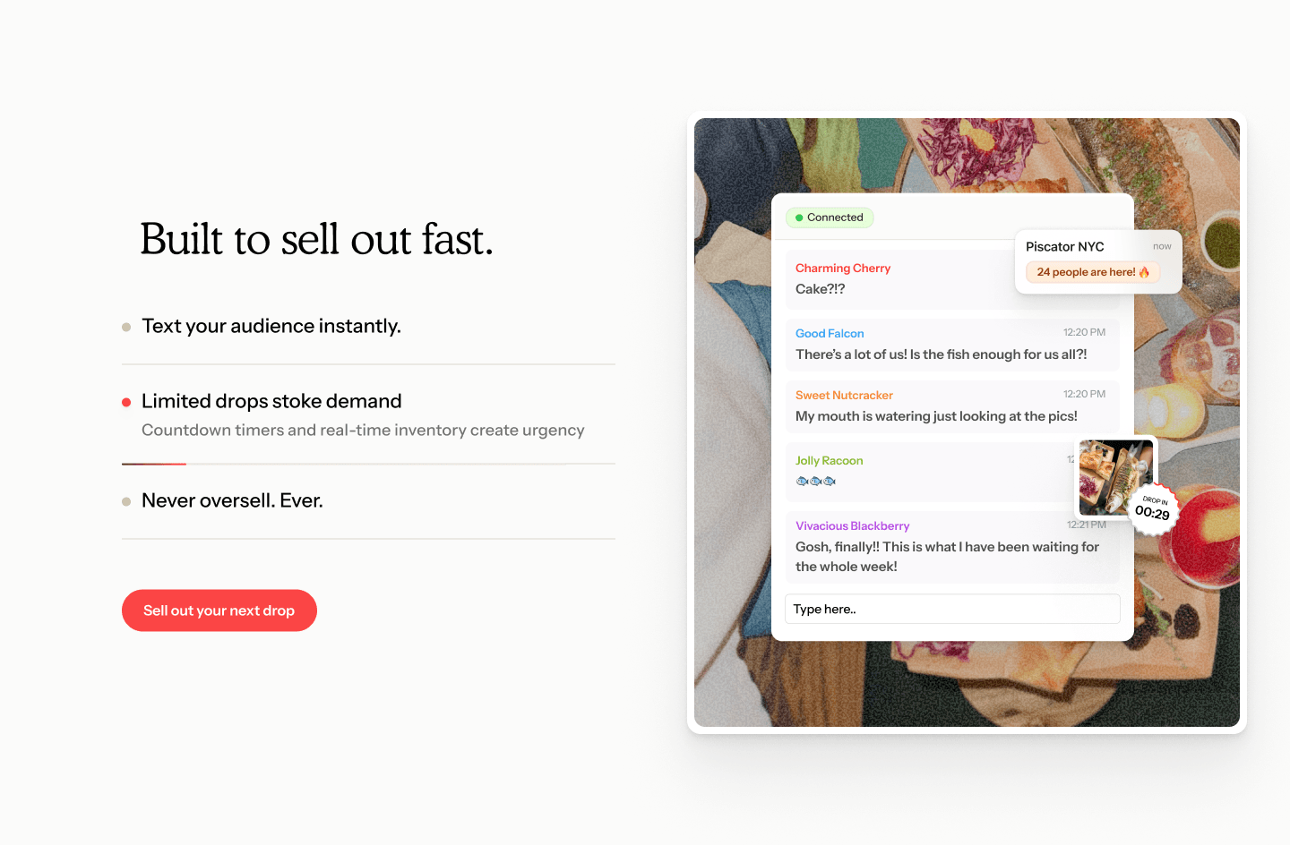
A short, focused website where you see how a drop works and what it makes possible for a business like yours. Real product UI takes you from posting a menu to preparing orders. The community carries the story alongside it — food from Hotplate chefs appears in the product graphics, while their testimonials and business results give the model credibility.
There’s a lot the platform does. The site brings it together through one clear story, grounded in the kitchens it’s built for.


Introduction
Most food platforms are built for restaurants. Hotplate is built for someone running a drop out of their kitchen. We designed the site to reflect that from the first screen.
The homepage follows the experience of running a drop: customers subscribe, the chef posts a menu, orders open, and food gets prepared for pickup. Each step pairs the interface with what’s happening around it. Automated texts connect a new menu to incoming orders. A prep list shows how those orders translate into what needs to be made. You see the product in use, with enough context to understand why each part matters.
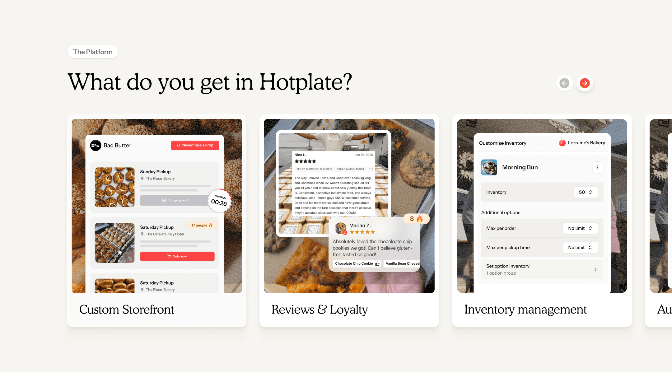


The community is part of the product story
The chefs aren’t confined to a testimonial section. Their food appears throughout the site and within the product graphics, keeping the interface close to the businesses it serves.
Their stories then give that experience another layer. Chefs talk about managing pickups, turning a social following into orders, and getting time back in their day. Names, locations, community numbers, and business results sit alongside those accounts. Together, they give visitors something specific to relate to: people, kitchens, and ways of working that look like their own.
A focused homepage, with room to go deeper
The homepage introduces the model, shows the experience, and lets the community speak to its value. We kept that narrative focused, with the fuller feature story on the product pages.
Those pages are organised around three jobs: Start, Grow, and Manage. A persistent tab lets visitors move between them, while accordion sections reveal individual features and update the accompanying product UI. Someone starting their first drop can explore a different set of needs from someone managing an established customer base.
That structure gives the breadth of the platform a place without asking everyone to read through all of it. The story stays connected to the work, even as the product detail gets deeper.




Working on something complex, ambitious, or hard to get right? I’d love to hear what you’re building.
Most of my work sits with teams solving complex problems — where design needs to hold up as products evolve and companies scale. If that’s what you’re working on, we’ll likely get along well.