About
Cross-platform design systems and pattern libraries for AI and SaaS product suites in healthcare and life sciences. The work spans stakeholder interviews, ecosystem audits, fresh AI product component discovery to build PoCs, and MVPs across web, mobile, and tablet experiences built with React, Angular, Vue, Veeva systems, and native iOS.
Challenge
Different technology stacks, legacy interfaces, and release constraints meant a shared design couldn’t always be implemented in the same way. The design system needed to establish where consistency mattered and where teams could adapt, with patterns that worked across environments.
At the same time, we needed to build the design system from the ground up to support AI-native products and tools that combined AI with automation workflows.
Outcome
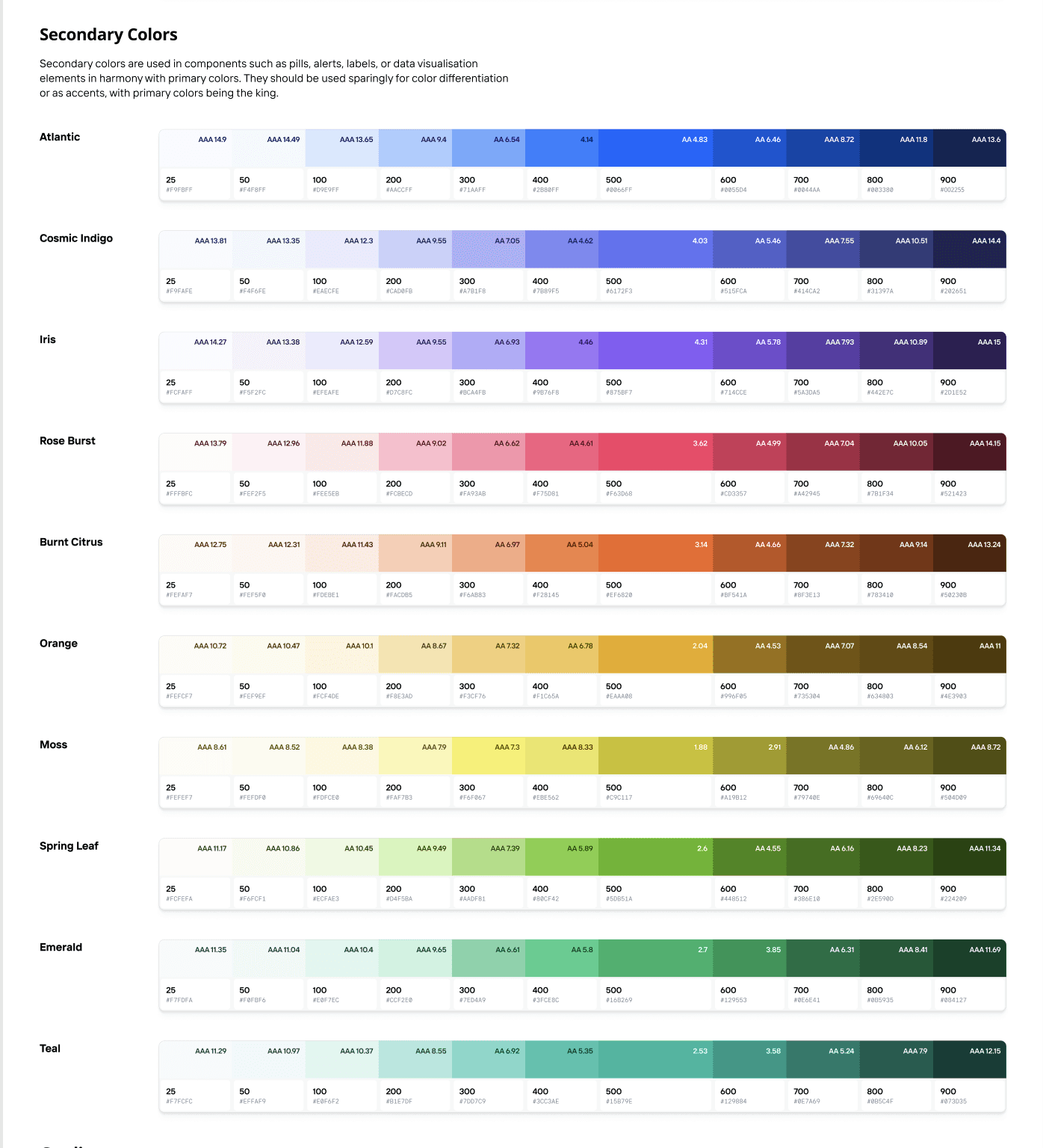
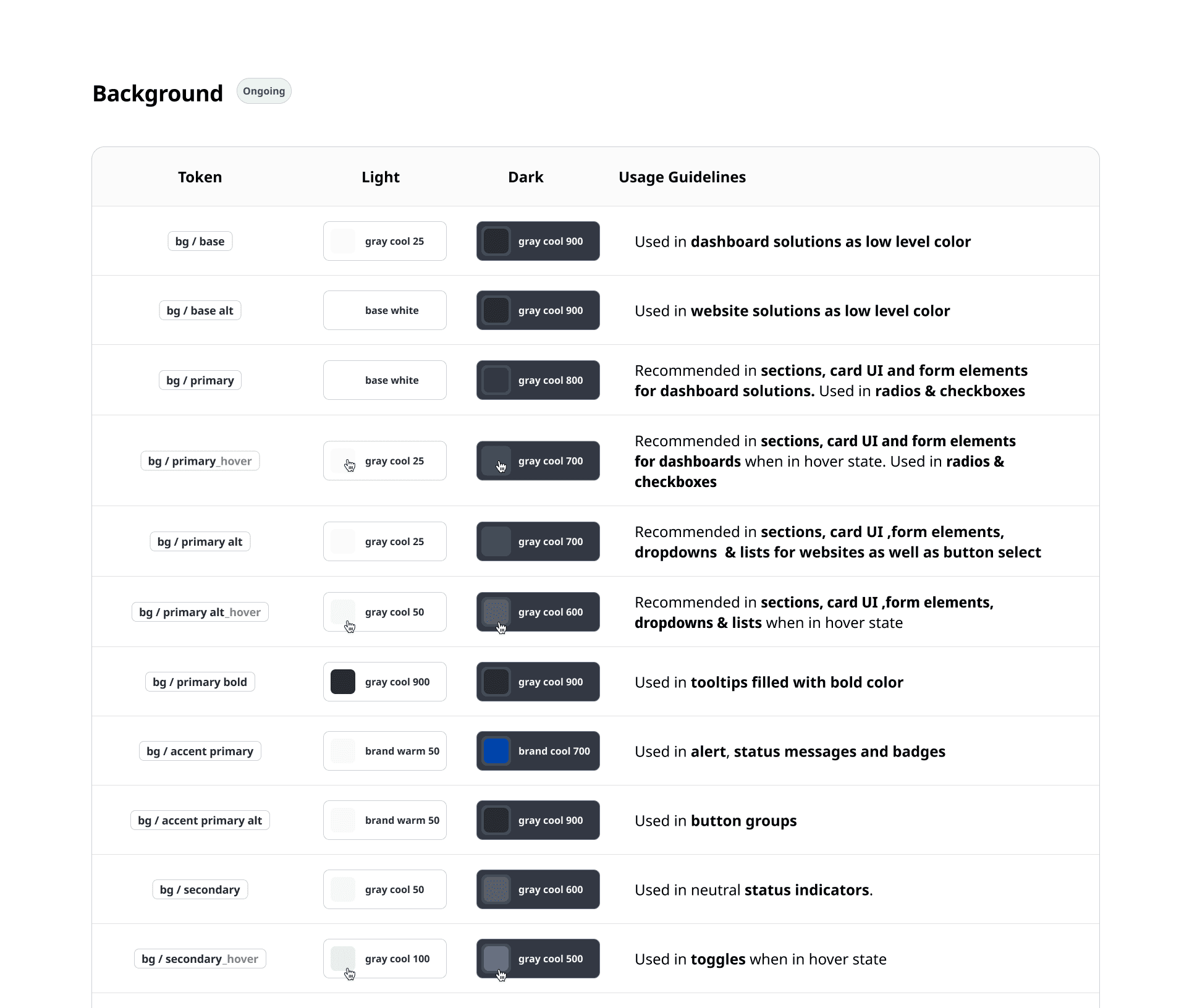
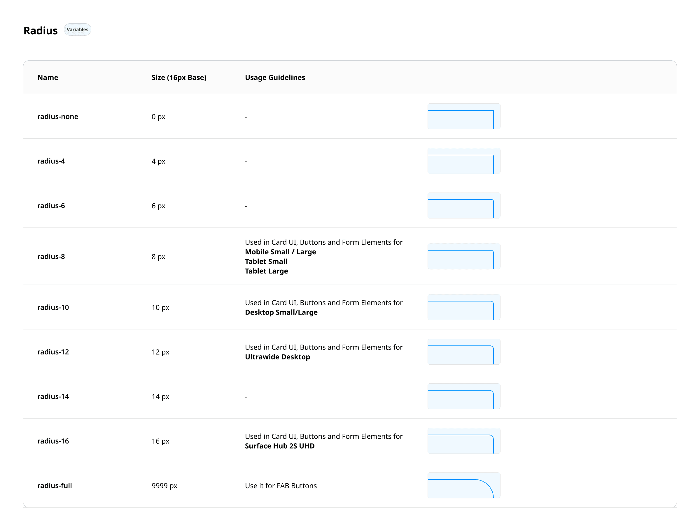
The systems are now used across 40+ products in four business lines. Shared tokens, components, and interaction patterns give teams a foundation they can adapt to their workflows and technical constraints.
Implementation guidance connects Figma specifications with Storybook and production review, giving design and engineering a common reference for behaviour, reuse, and necessary variations. Consistency extends into how the products are built and maintained as the ecosystem grows.
✦ Introduction
When working on enterprise-scale design systems, I always start by zooming out — looking at the bigger picture of how multiple product suites connect, operate, and evolve over time. Typically, I'm part of a lean cross-functional pod: one senior from the client team, a junior from their side, and myself leading design. What makes this setup work is our shared commitment to go beyond visual kits — we dig into actual workflows, user journeys, and tech ecosystems.
The foundation is always research. Understanding the specific contexts of designers and developers across internal, vendor-side, and cross-product teams matters because each has different needs. A team building a conversational AI interface thinks differently than someone working on a supply chain content platform. So instead of starting with a generic component library, I begin with a workflow audit — understanding how and why each pattern exists.
✦ Starting with a product ecosystem audit, not a component library
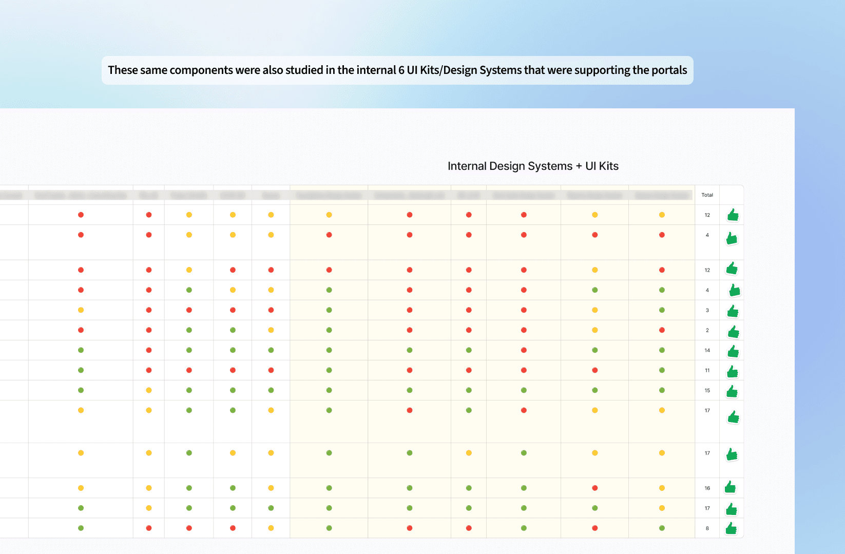
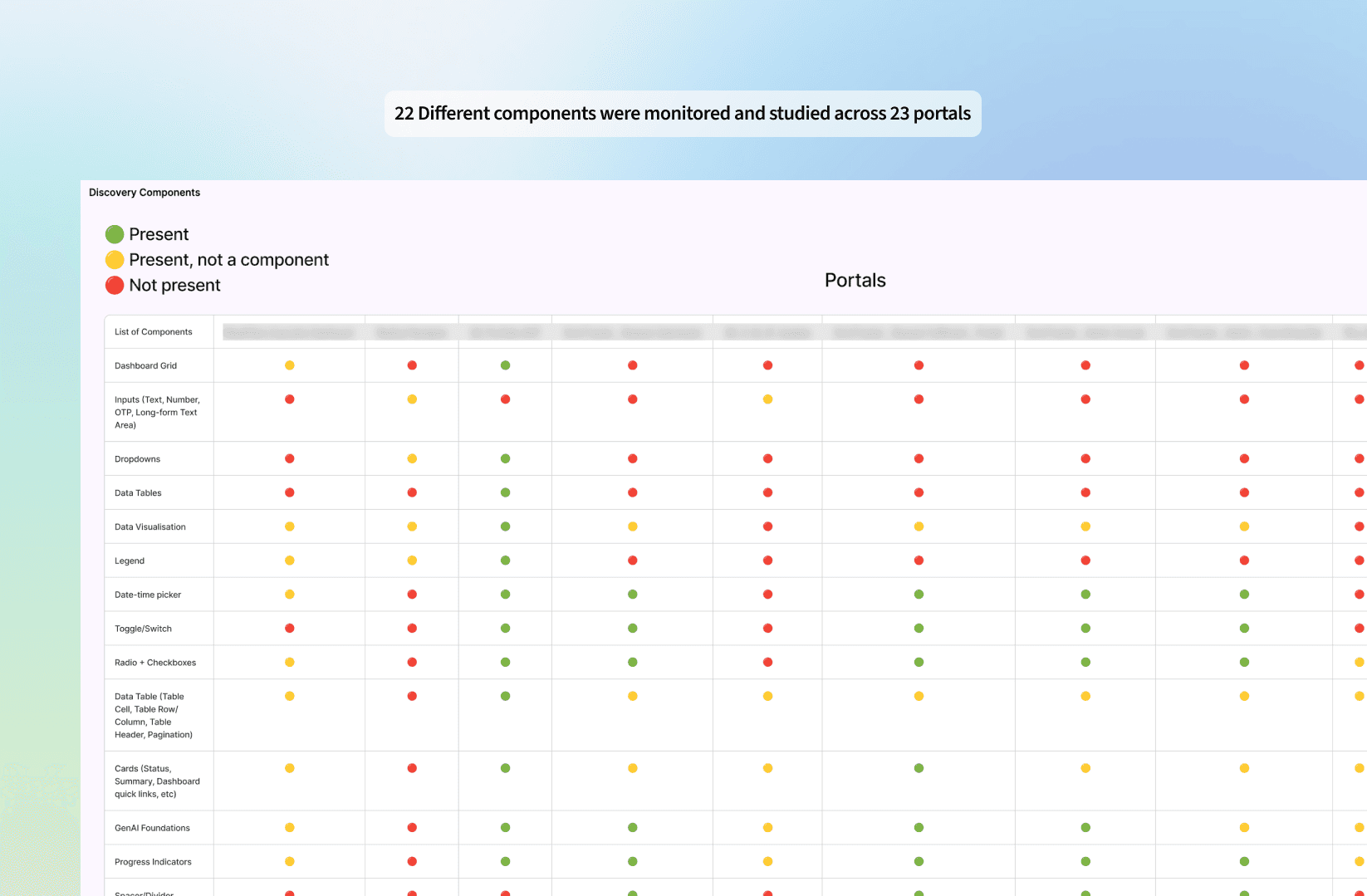
We map out the key systems in play — internal portals, third-party tools, and headless platforms — then conduct a detailed audit of workflows, components, and patterns in use. But instead of just capturing what exists, we ask deeper questions: Why was this layout chosen? What friction points do users face? Are these patterns optimised for how and where users actually work?
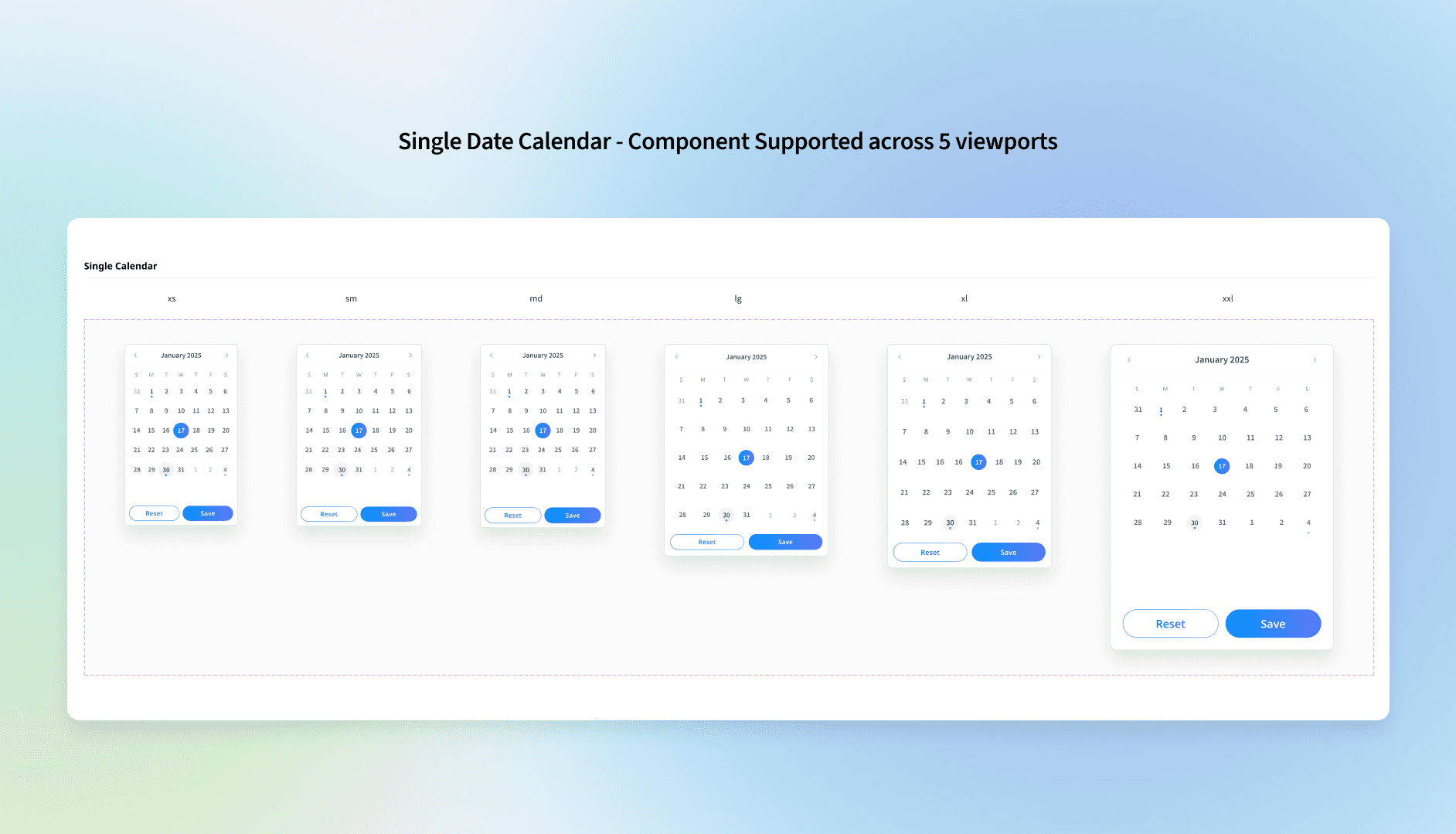
✦ Designing for multiple viewports
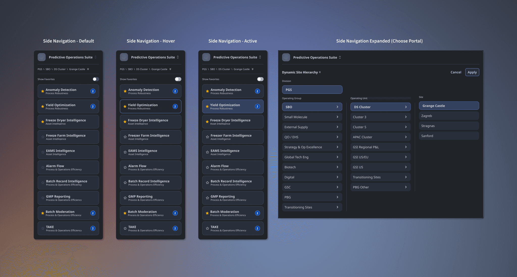
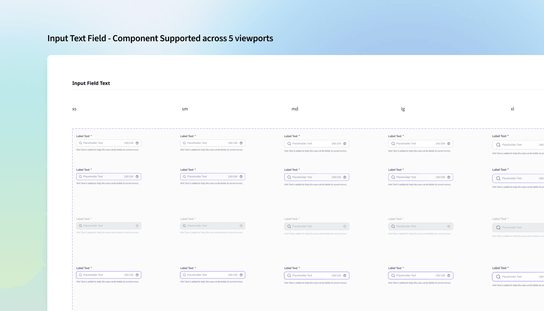
User context is everything. In manufacturing and supply chain environments, users often rely on tablets or large-format desktops on the shop floor, while quick mobile inputs are used for incident logging. Desk jobs demand robust dashboards on laptops or desktops. We also evaluate the tech proficiency of each user group — so we're designing for real-world usage, not ideal scenarios.
✦ Designing for varying use-cases across product teams & users
Sometimes it makes more sense to offer a combination of components with similar application logic, because the different needs of projects and users demand it.
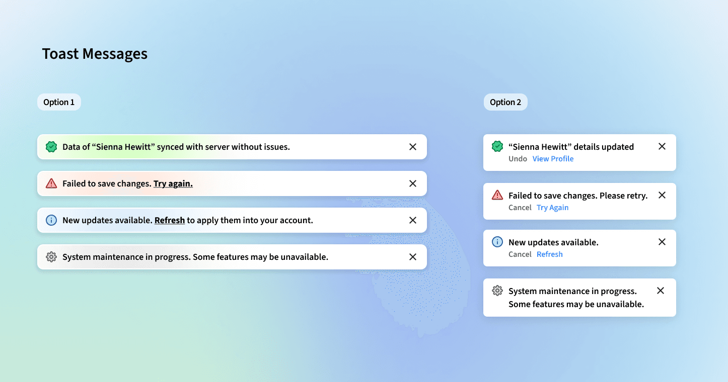
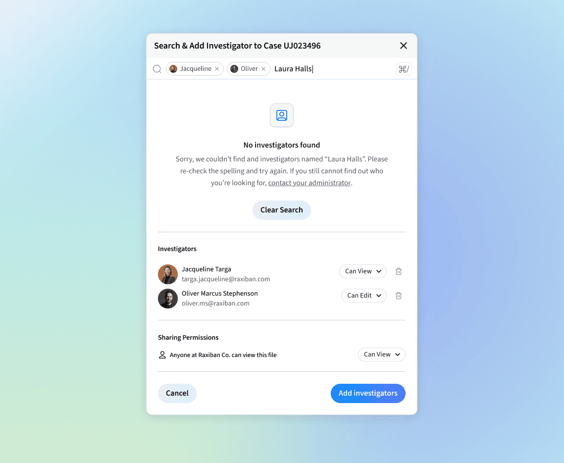
Toast Messages: We identified two types in our audits — a long banner at the top center for desktop, and a bottom-right corner toast. Mobile users tend to prefer the bottom-right. Both styles exhibit similar usability benefits, so both components can be implemented — provided they're used consistently throughout the portal without mixing the two.
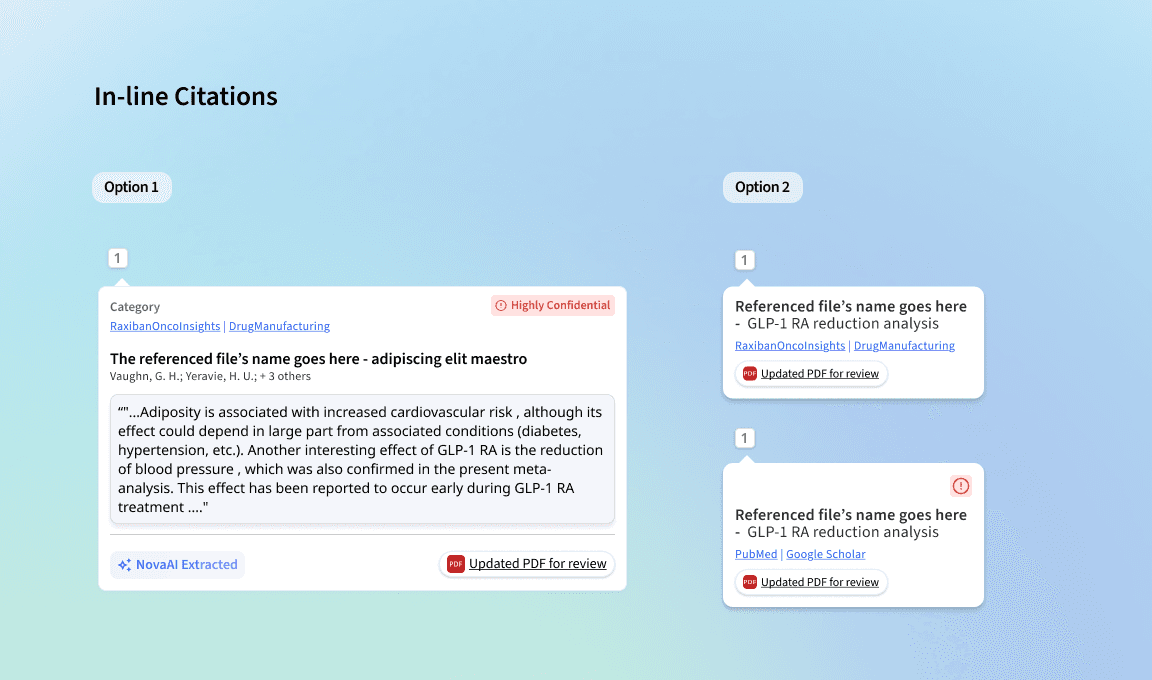
In-line Citations: It's not always possible for back-end teams to implement in-text citations with hover functionality for a first release. So a simpler option was designed: users click the citation number to view references in a side panel or on a separate page.
✦ Prioritising patterns over components at scale
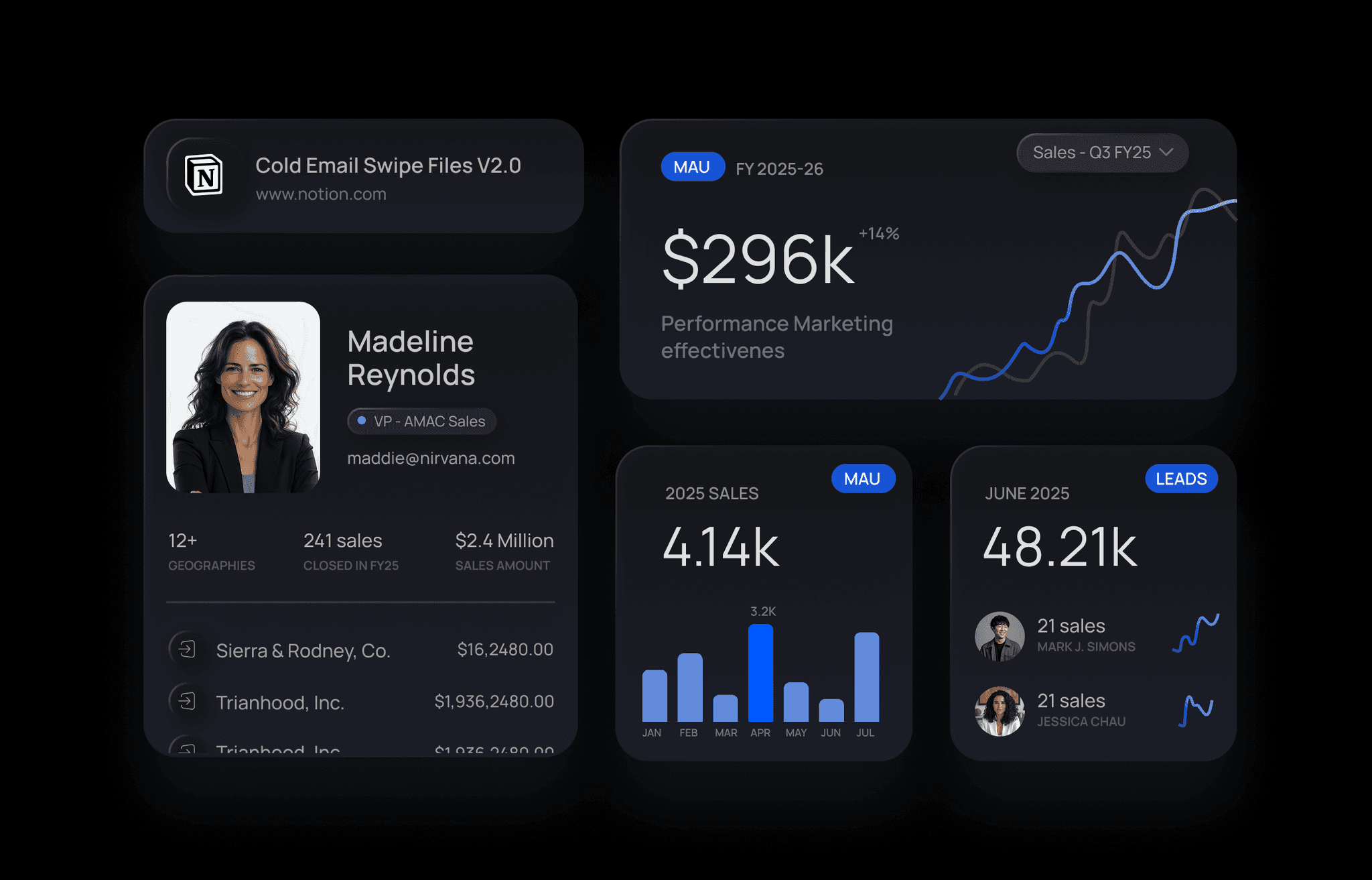
What starts as a single component — a button, a card, an input — quickly scales into patterns in context. A card becomes a dashboard module. A table combines with filters, bulk actions, and pagination to form a complex data-management pattern. These aren't just UI clusters — they're systems of interaction.
This is why we build with reusability and modularity in mind. By tokenising even the smallest design decisions, we create atomic pieces that fit into larger, more intelligent systems. These patterns flex and scale to support everything from GenAI interactions to supply chain escalation flows — adapting to different user roles, environments, and intents without breaking consistency.
✦ Launching GenAI-focused components, patterns, and hybrid components
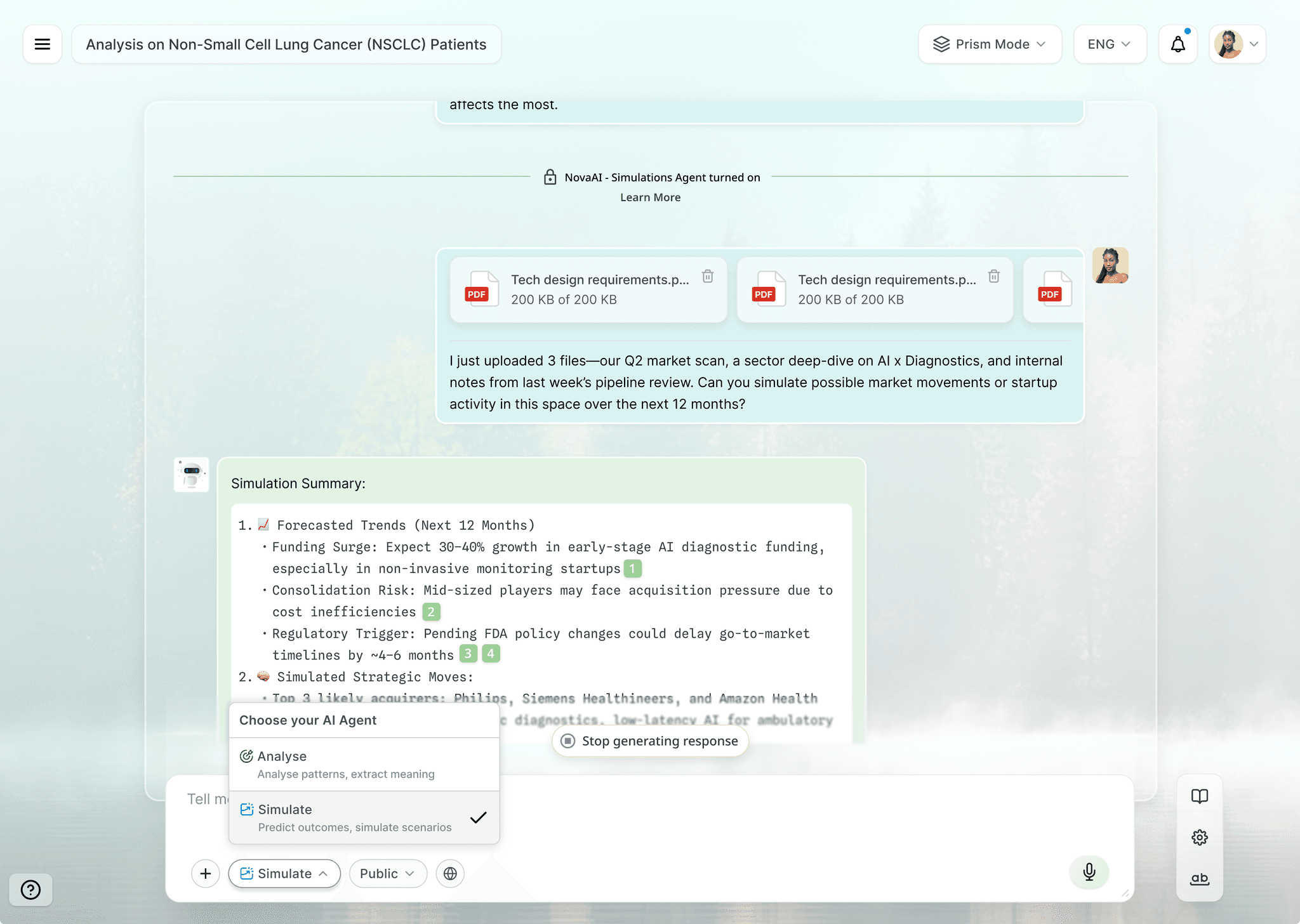
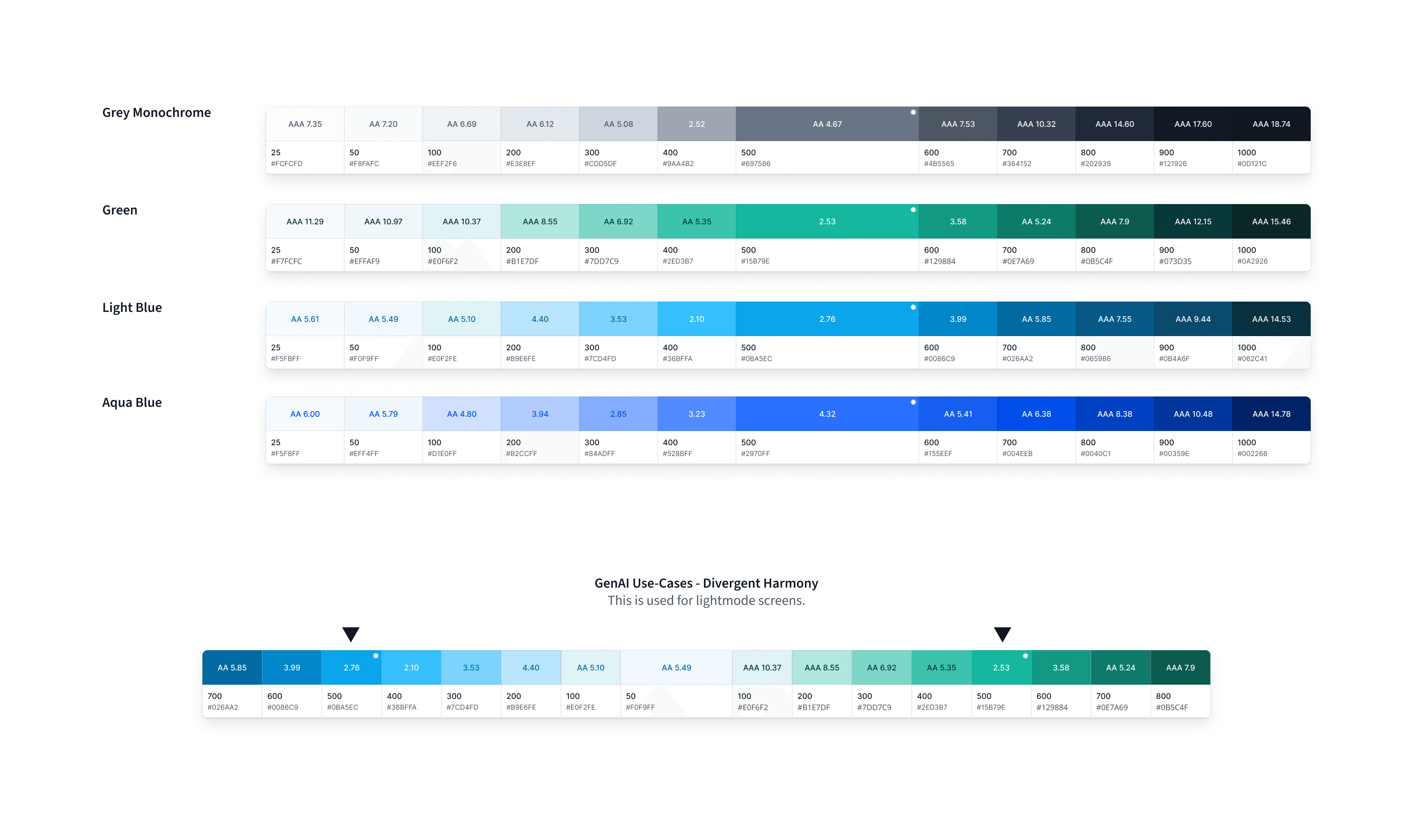
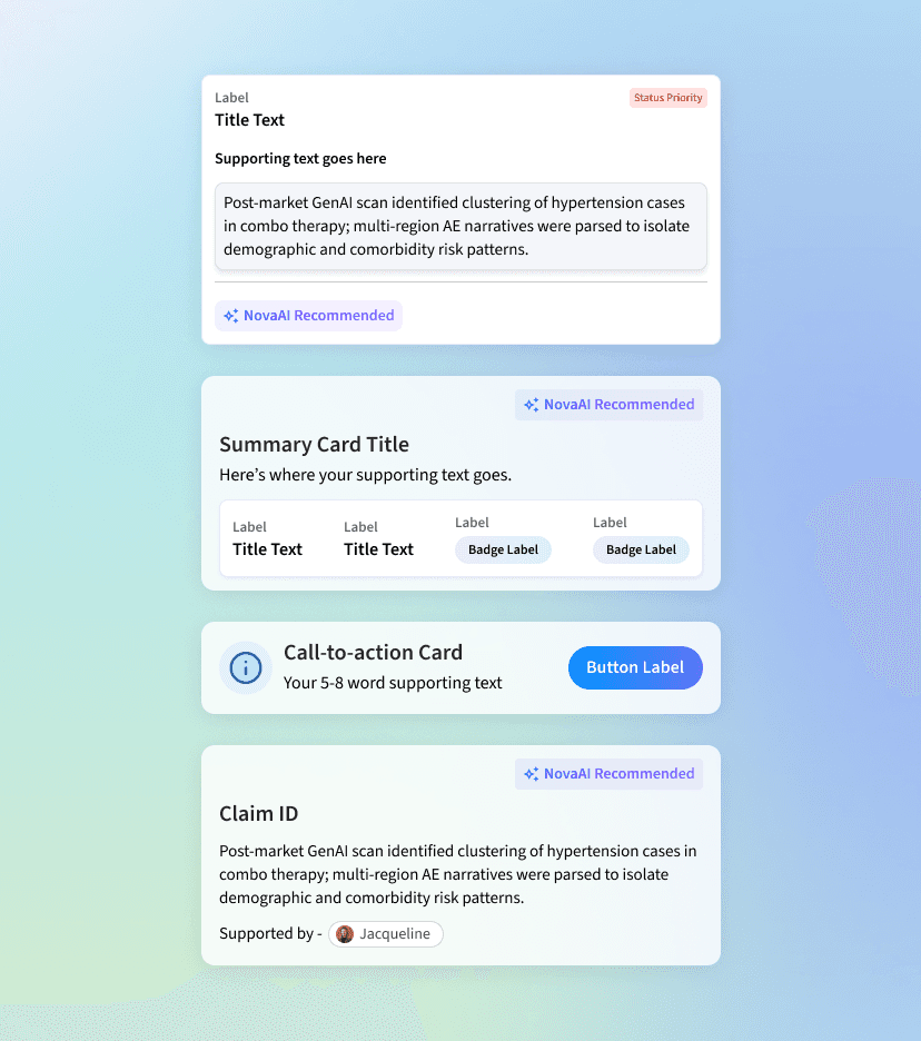
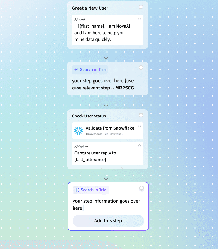
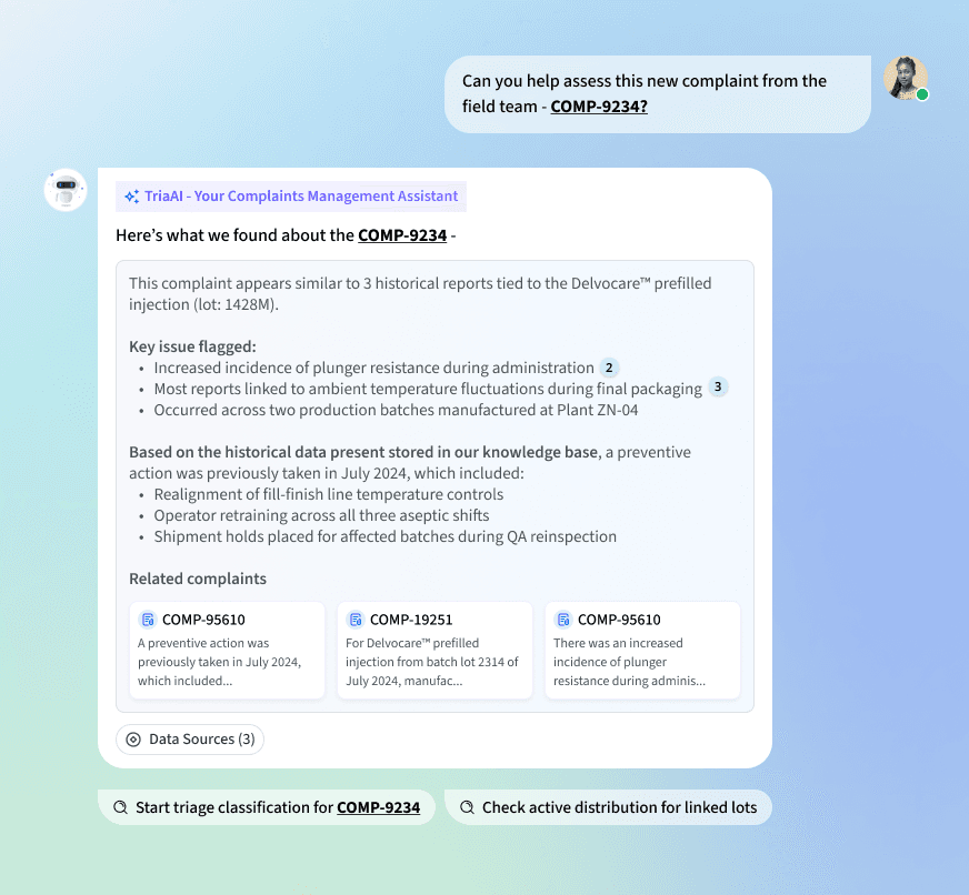
GenAI is reshaping how we think about design systems — it's about architecting the entire system to support GenAI logic and behavior at scale. One key principle: helping users visually distinguish between automated flows and GenAI-driven actions, so they can understand what's happening and feel confident trusting the system.
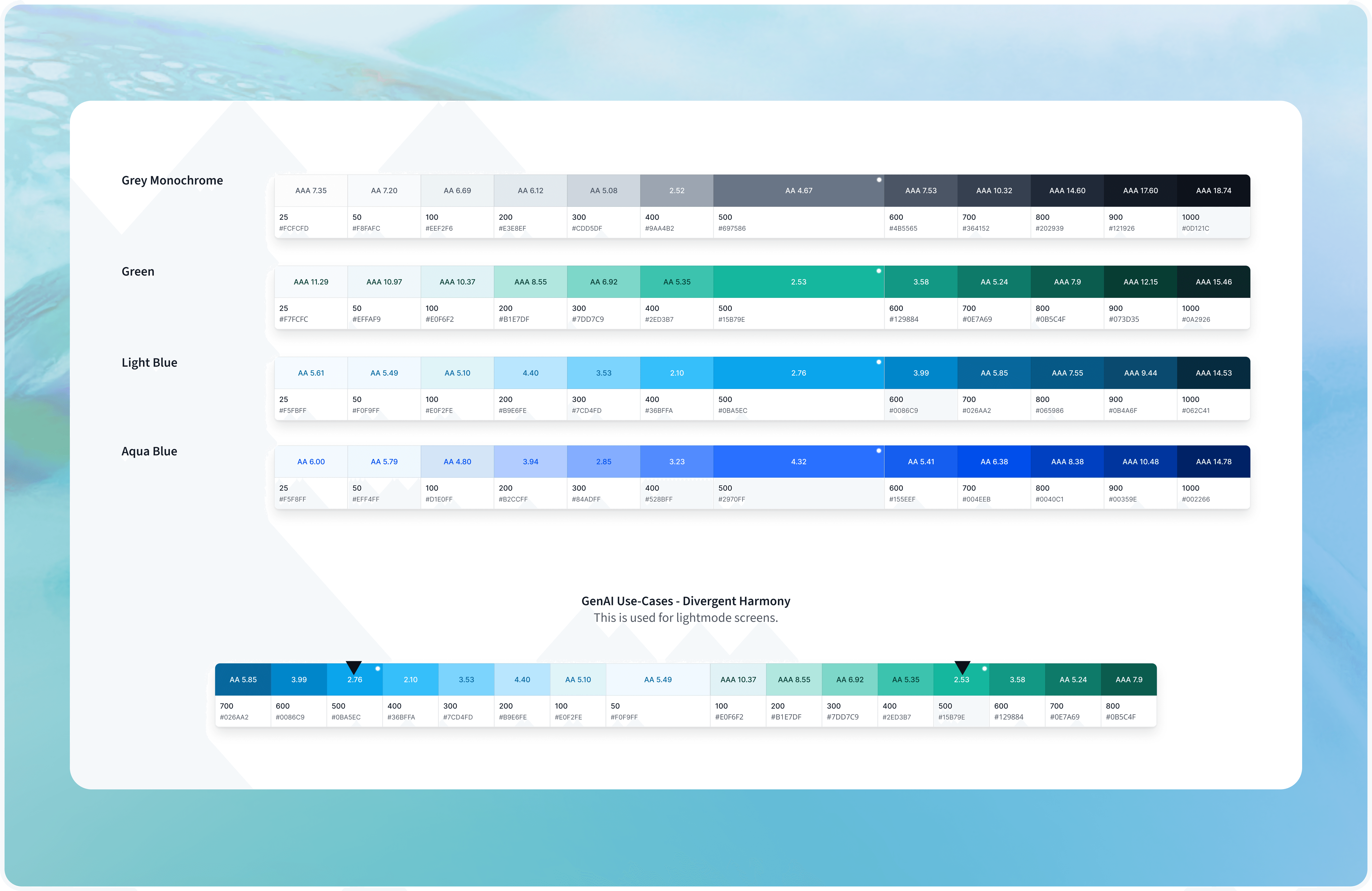
Across various GenAI use cases — conversational platforms, document generation tools, simulation systems — we've uncovered emerging pattern needs specific to each context. In a conversational AI interface, a chat bubble + system response pattern works hand-in-hand with a "model system instruction" module. Casual users focus on query-response; advanced users rely on configurable system prompts to fine-tune behavior. Designing for both levels of interaction has been central to the system's flexibility.
✦ Explorations with Claude, VS Code, and agentic tooling
One of the more recent shifts in this work has been integrating agentic tools directly into the design workflow. I've been using Claude to pressure-test component logic, draft and refine design documentation, and validate naming conventions across token layers — particularly for the Figma-to-Storybook handoff pipeline.
With VS Code, I'm able to bridge the gap between token specs and implementation faster — reviewing how tokens render in production and catching discrepancies before they become systemic issues. The broader shift is using AI not just as a writing or generation tool, but as a thinking partner for systems work: mapping edge cases, auditing pattern coverage, and thinking through multi-viewport behavior before a single frame is built.
Working on something complex, ambitious, or hard to get right? I’d love to hear what you’re building.
Most of my work sits with teams solving complex problems — where design needs to hold up as products evolve and companies scale. If that’s what you’re working on, we’ll likely get along well.

Designing clarity into a new food business model — so the website sells without over-explaining
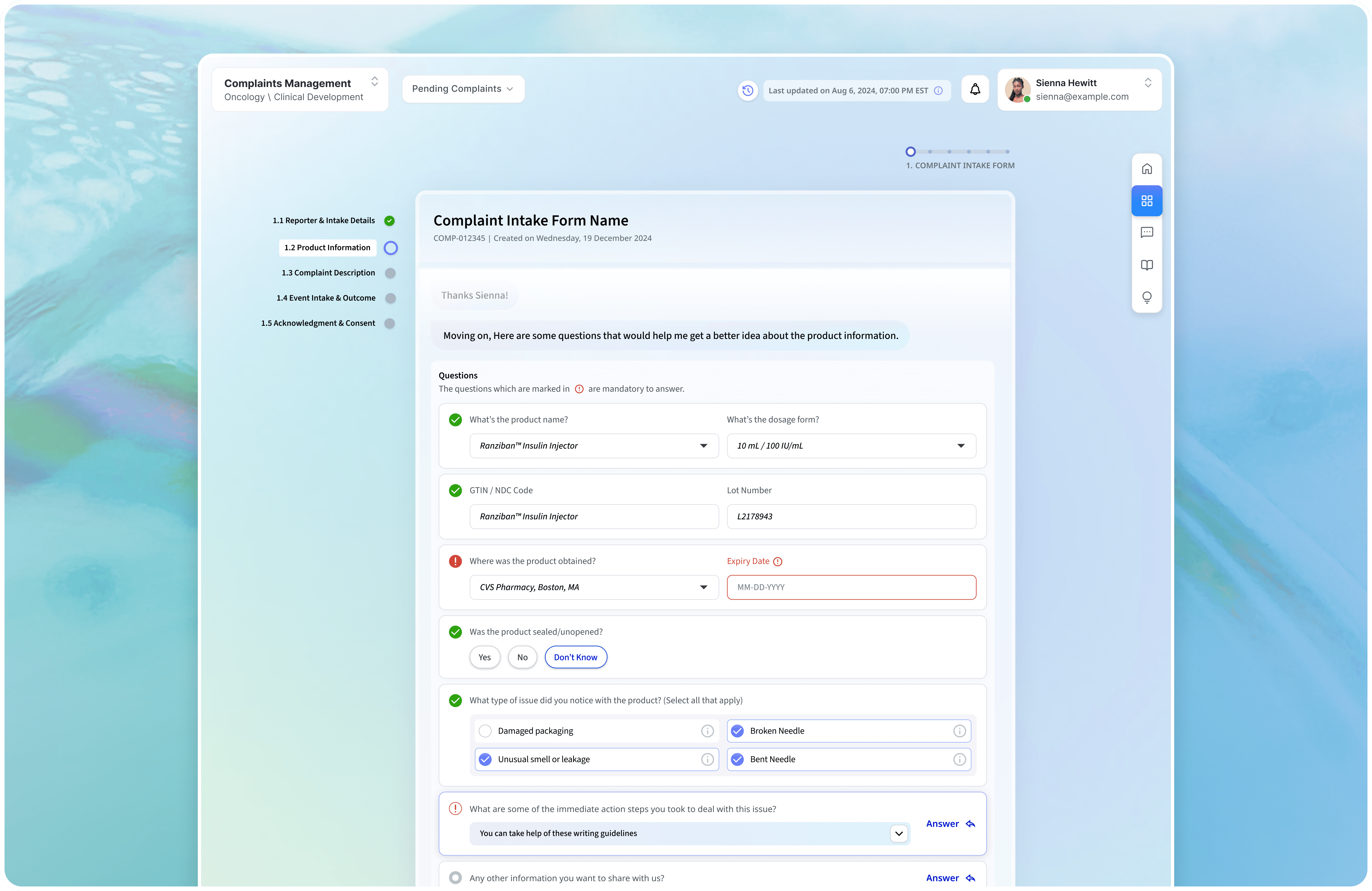
Building an enterprise complaints portal without sacrificing compliance or human judgment.
Making trading education feel credible in a category built on hype.

Brand and product narrative for a cybersecurity company