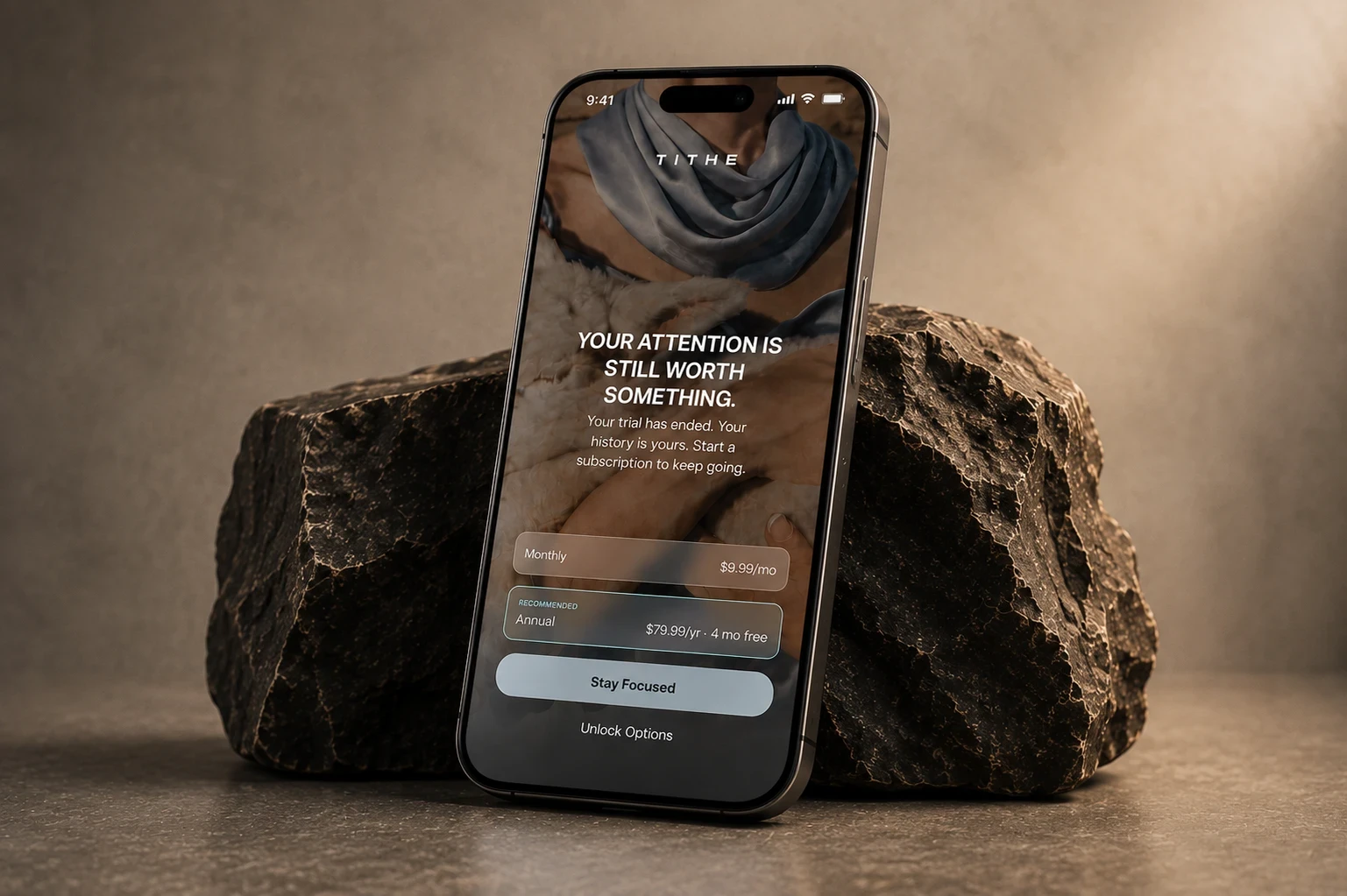
About
Tithe is an iOS focus app built around the idea that your attention is worth something. The project, with Bright Studios, covered product and visual design for an experience where breaking focus comes with a consequence.
Challenge
The consequence needed to feel meaningful without making the app feel punitive. The challenge was to make protecting your attention feel personal and deliberate, while asking for as little of it as possible.
Outcome
A focus experience built around the moment someone decides to get distracted. Selected apps are blocked during a session; unlocking them means putting money towards savings, supporting a cause, or meeting a movement goal. The cost is clear, and the choice is conscious.
The rest of the app stays quiet. Hours reclaimed anchor the dashboard, with simple controls for starting and scheduling focus. Editorial photography, tactile textures, and a warm visual identity give Tithe a place in someone’s everyday life. The experience carries the same intention throughout: make attention feel worth protecting.

Project Overview
Tithe is an iOS focus app built around a simple behavioral idea: your attention is worth something. And breaking that focus should have a cost.
I designed the product and visual experience for an intentionally different kind of focus tool — one that doesn’t lecture you about productivity, drown you in metrics, or feel like another utility on your phone. Instead, Tithe makes the act of protecting your attention feel tangible, personal, and a little more considered.
The experience combines focused UX with a lifestyle-led visual language, turning a functional productivity tool into something that feels more like a product you actually want to spend time with.
A different kind of focus app
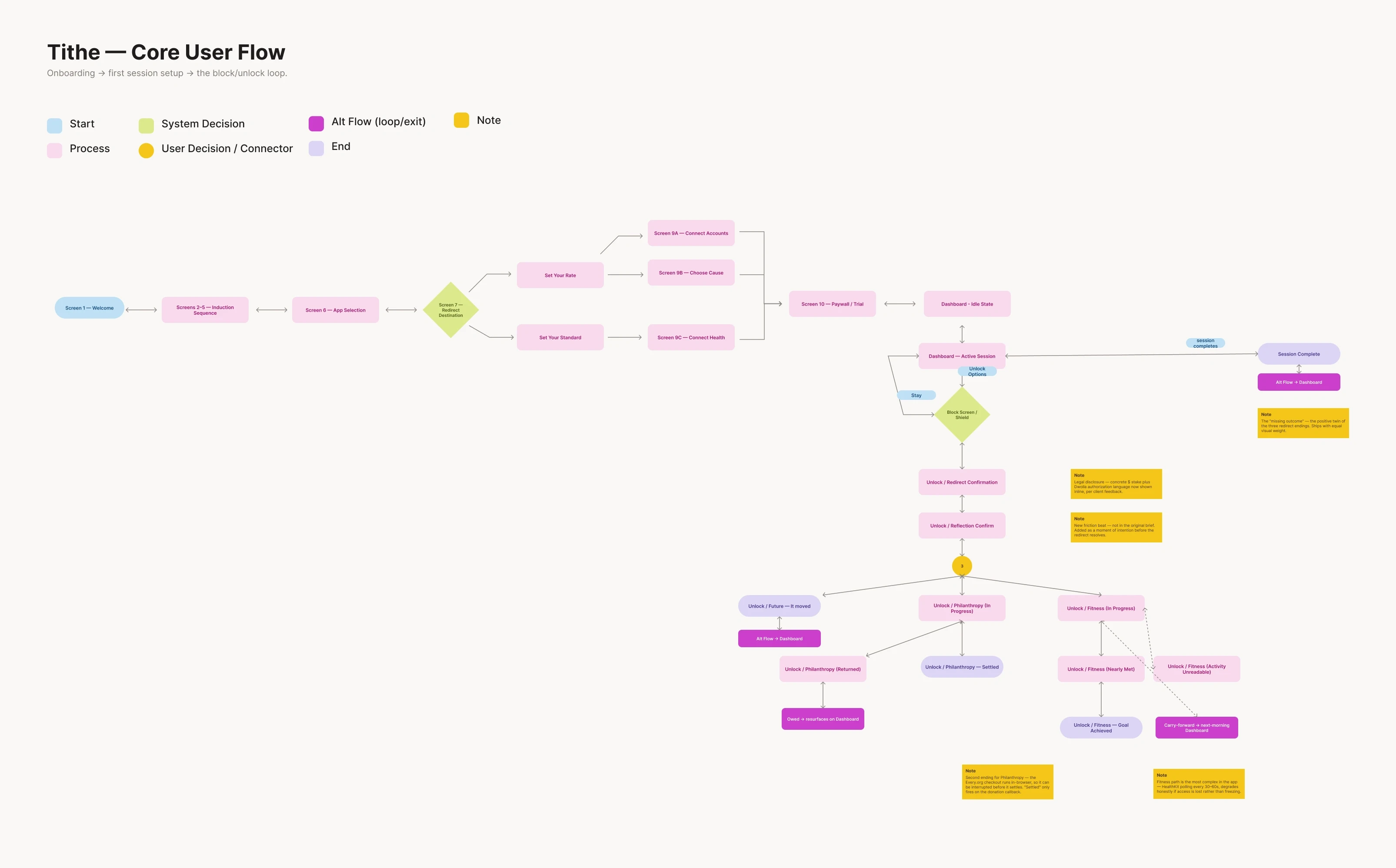
When a focus session is active, selected apps are blocked using Apple’s native Screen Time experience. If you try to open one, you get a moment to decide whether you really want to break the session.
If you do, your attention is redirected in one of three ways:
Future — a set amount moves from checking into savings.
Philanthropy — the amount goes towards a cause you care about.
Fitness — you earn your access back by reaching a movement threshold through Apple Health.
I liked that the mechanic makes the decision feel tangible without making a big deal out of it. You either stay focused, or you consciously choose otherwise.
Making a utility feel like a lifestyle brand
A big part of the work was making Tithe not feel like a productivity app.
The visual direction takes cues from brands and spaces like Soho House, Open, and Pillow Talk — more editorial, personal, and lifestyle-led. Photography does a lot of the work, supported by typography, tactile textures, and a powder blue and espresso palette.
The textures were especially important. Burl wood, suede, cashmere and other material references helped give the interface a little more warmth and personality without making it feel busy. Even the lamb has a small role in the identity, referencing the idea of a tithe as an offering.
Designing for less - the least possible distraction + addiction
The rest of the product follows the same idea.
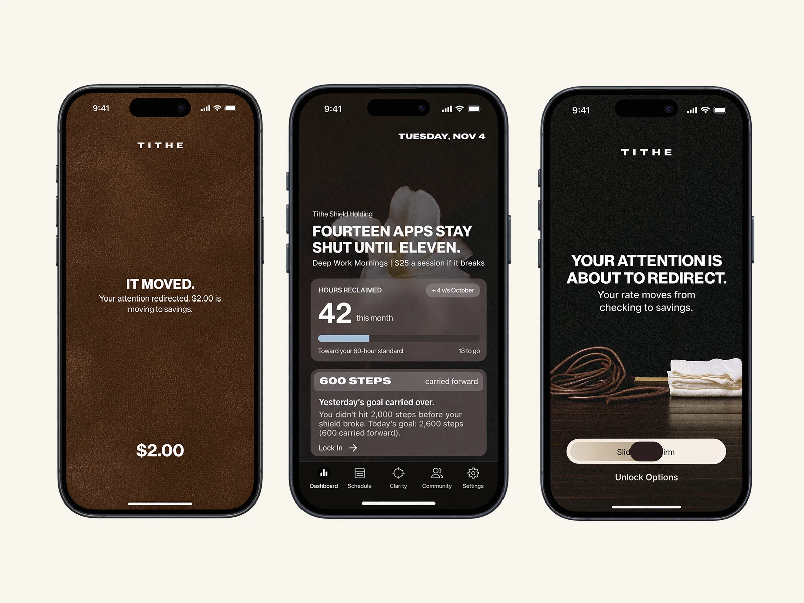
Dashboard — centred around the one number that matters: hours reclaimed, rather than a wall of productivity metrics.
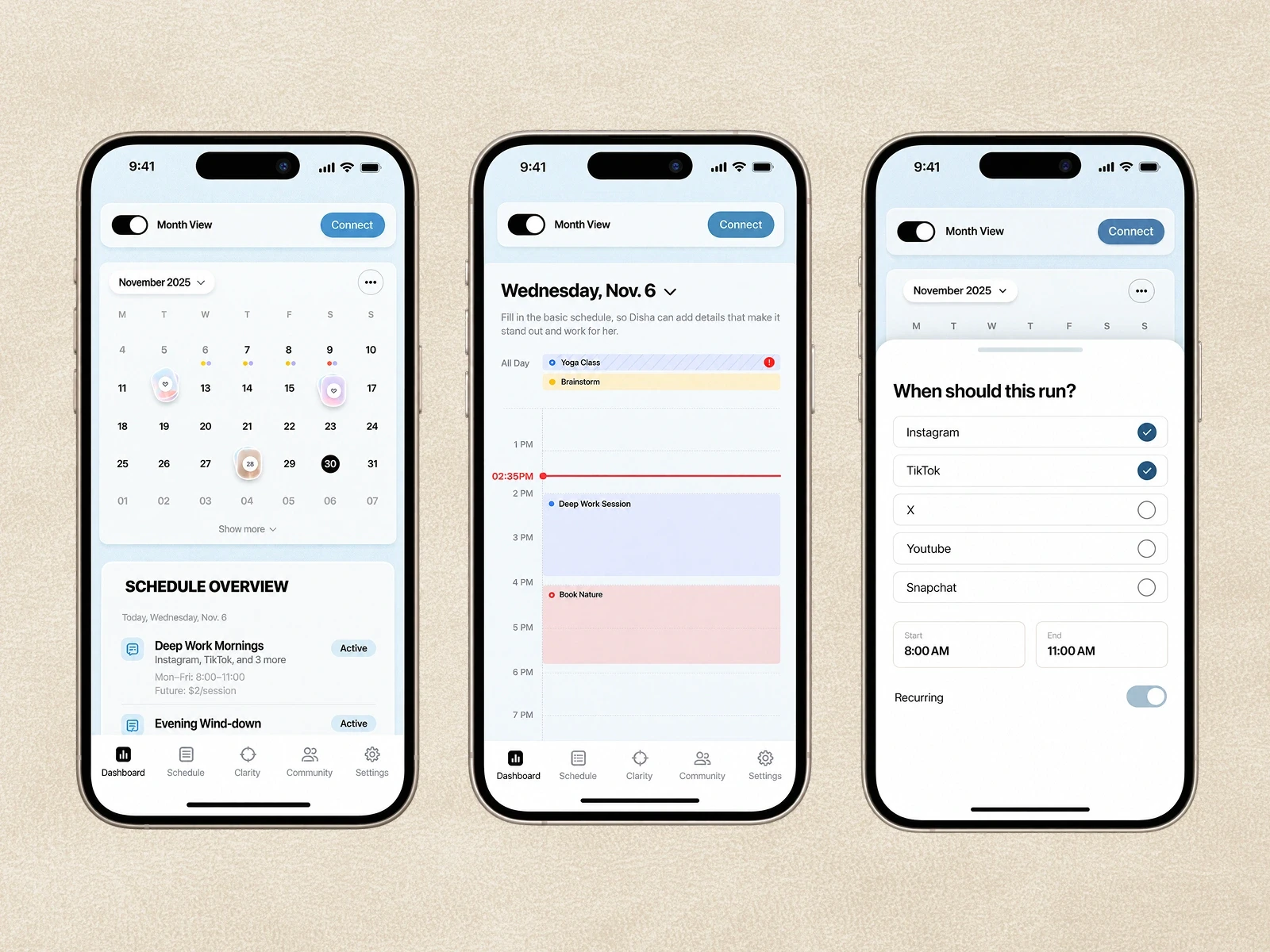
Quick Focus + Scheduling — simple ways to protect time without over-configuring it.
Clarity — gradually surfaces patterns in how you use your attention, without telling you what to do.
Block + Unlock — designed around a small moment of friction, so breaking focus feels intentional rather than automatic. The overall goal was pretty simple: make the product quiet, but not boring; considered, but not complicated.
Something that helps you focus without constantly reminding you that you're using a focus app.
Working on something complex, ambitious, or hard to get right? I’d love to hear what you’re building.
Most of my work sits with teams solving complex problems — where design needs to hold up as products evolve and companies scale. If that’s what you’re working on, we’ll likely get along well.

Designing clarity into a new food business model — so the website sells without over-explaining
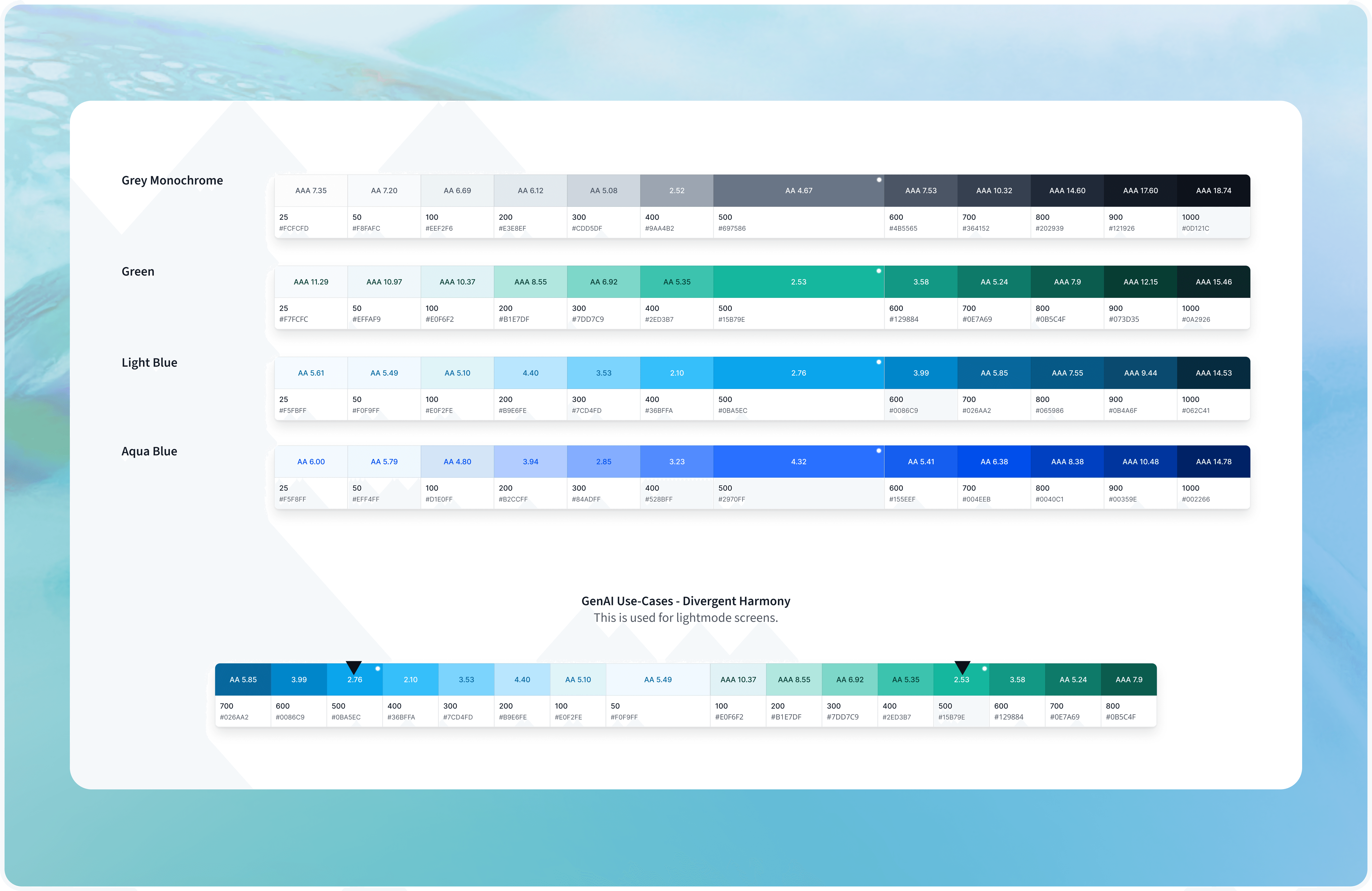
Building Enterprise-Scale Design Systems for Multiple Product Suites
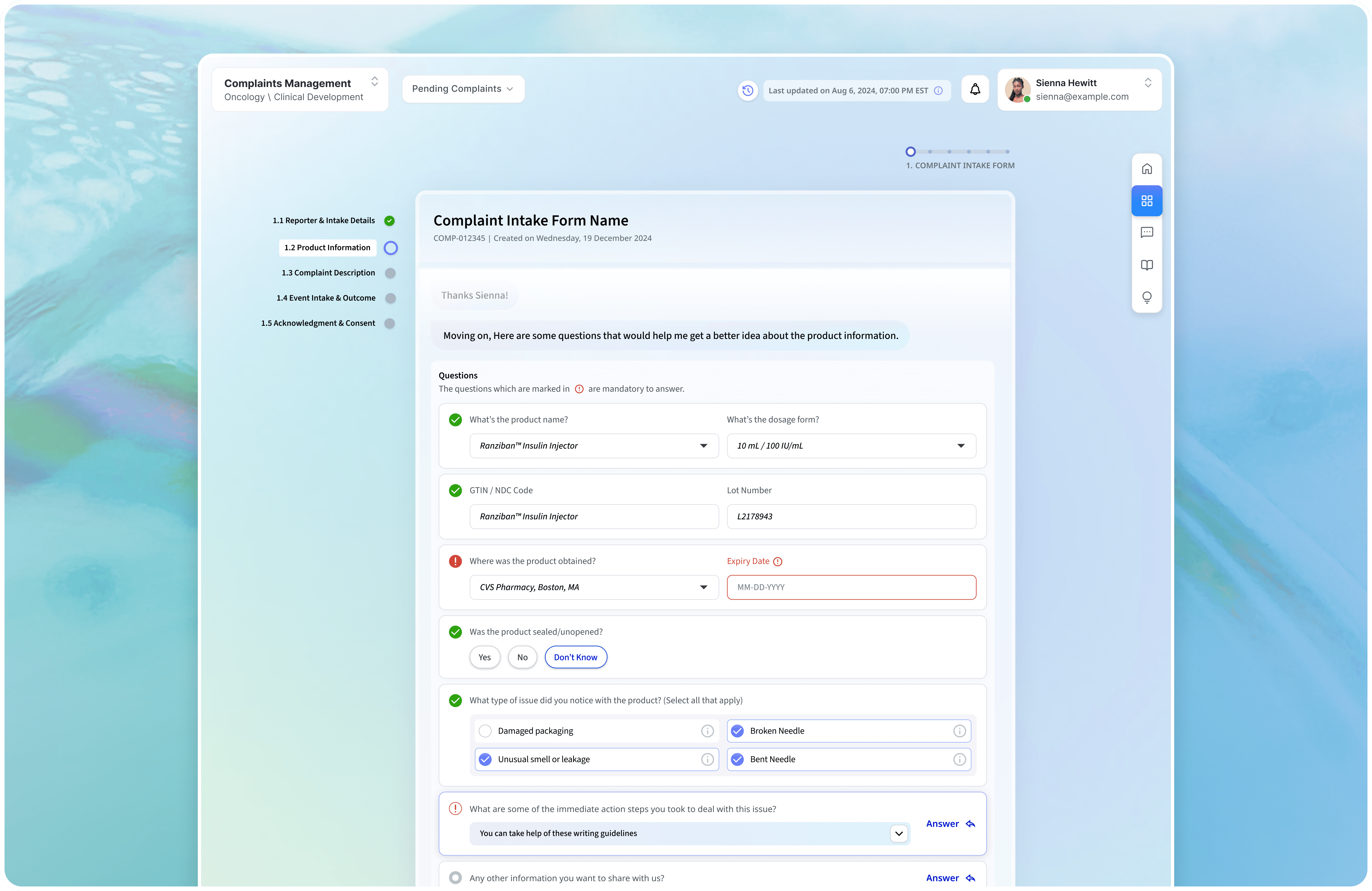
Building an enterprise complaints portal without sacrificing compliance or human judgment.

Making trading education feel credible in a category built on hype.